REVIEW: How to Build a Disaster Proof House

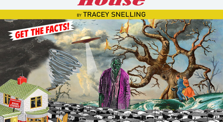
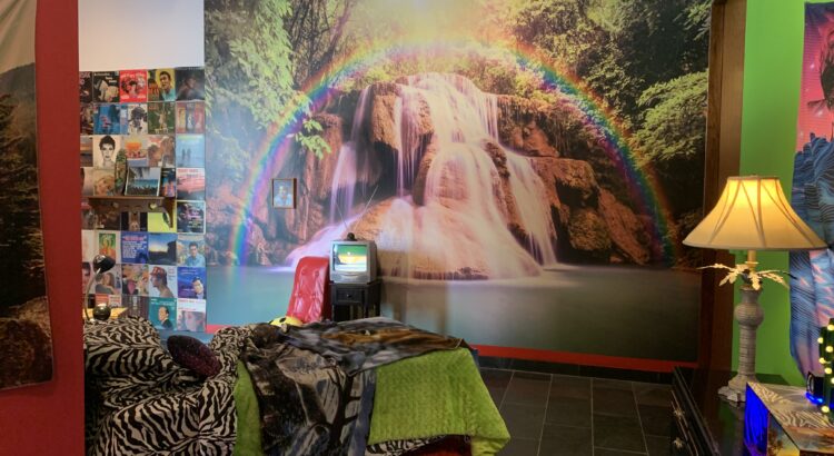
How to Build a Disaster Proof Home is the latest installation at the Institute for the Humanities on campus. Artist Tracey Snelling transforms the space into an explosion of color, sound, and texture as various home interiors occupy the room. Working both on a life-scale and a miniature scale, Snelling presents an exploration of what home really means and how one mentally and physically finds refuge in the contemporary world.

I’d like to examine this exhibit in a bit of a fractured way, pinpointing and elaborating upon various aspects as these come together to create the complete multisensory experience of Snelling’s work. Firstly–the aural. Before you even enter the space, you can hear a variety of monologues, sound effects, and music. This is because almost every section, or constructed home, has accompanying audio materials. Whether that’s a series of films being played all at once, or Duran Duran filling up a corner of the space, there’s a sense of the place being alive. The weaving together of sounds (the less delicate may call it a cacophony) create an entirely new sonic experience, one where the simulation of human presence is achieved. This simulation has both the comfort of a TV left on in the living room and eeriness of interacting with Siri or other faux-human presences. 

The same kind of aural complexity exists in the textures of the space. You find the tactile, familiar comfort of a worn rug juxtaposed with the tackiness, insincerity, and flatness of an idealized sunset-rainbow-beach wallpaper. There’s a dedication to different temporalities here, as a portrait in 70’s fashion hangs above a cherry red plush carpet circa the year 2000. The melange of these tributes to homes of past decades is fun and very carefully coordinated to maintain coherency, but there’s also a deeper, more touching and humanistic idea at the core of how we maintain familiarity and keep the things that we treasure most close to us (even if that’s the flimsy metaphor of hope behind a rainbow).


Finally, the color is alluring. Bright tones, eye-catching patterns, and iridescent touches are not only attractive, but add a very specific voice to the message of this exhibition. Ultimately, How to Build a Disaster Proof House is a sensory delight that makes you appreciate wherever you call home.

PREVIEW: How to Build a Disaster Proof House

The Institute for the Humanities’ latest exhibition will be on view this week, beginning March 16th. How to Build a Disaster Proof House consists of the work by the current Roman Witt Artist in Residence, Tracey Snelling. Snelling previously exhibited here and has come back again with sculptural conceptions of various worlds, looking to themes of escapism and environment while also integrating eye-grabbing pop aesthetics.


The show is free and certainly not one to miss, as there’s a slew of accompanying programming in conjunction with the works. It’s truly a community effort, as talks and workshops intersect with corresponding exhibitions and installations coming from institutions like the Ann Arbor Film Festival and the Ann Arbor Art Center.


The Institute for the Humanities is right across from the MLB, situated right in central campus– be sure to stop by!

REVIEW: The Worst Person in the World

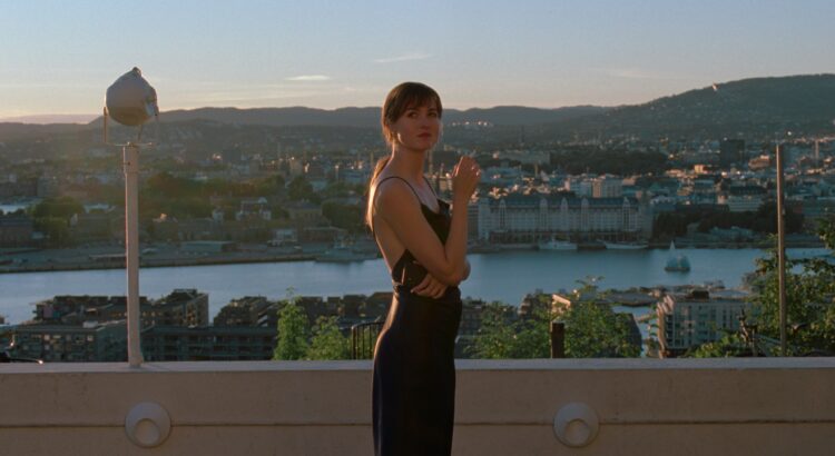
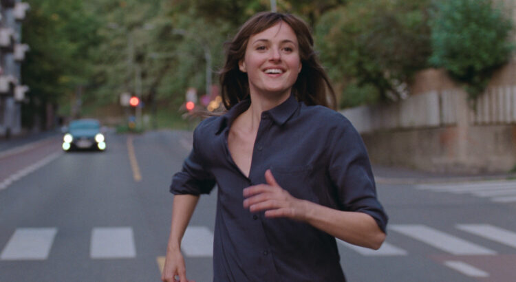
The Worst Person in the World is an anthology of sorts, chronicling a young woman’s struggles with making meaningful connections, navigating her career, and establishing her general place in the world. This sounds extremely cliché on paper, and I hate to say it but it somewhat held true in the film as well. 


I will firstly recognize that there’s a very strong chance I simply didn’t connect with this film. Sometimes that just doesn’t happen. There was still a sense of quality to the production and the performances did feel genuine, so maybe the fact that I walked away feeling very little is moreso a matter of a personal misalignment.


That said, I think there are a few other factors that caused me to feel so neutral. The style of the film felt a little inconsistent and choppy, this owing greatly to a scene involving psychedelics. All the established conventions of the drama that had been unfolding thus far were eschewed in favor of overblown effects, animation, and surreal sequences. I understand that there’s a lot of fun, playful techniques that can be used to convey an experience like that and there are moments of quick, pastiche editing earlier in the film, but in this case it just felt out of place and a little indulgent. Another particular instance of a chapter that didn’t fit quite right was a short one that used constructed media clips that we watch the protagonist watch. This isn’t inherently bad but it just felt disjointed in terms of style.


Another manifestation of this choppiness was the excessive structuring of the narrative. There was a prologue, an epilogue, and twelve individually named chapters between. For an ultimately chronological story, these separations felt unnecessary and moreso a chance for foreshadowing puns and dramatic titling. I do think it was an interesting mode of pacing for viewers, but making sections more discrete didn’t serve the narrative’s development and the emotional shifts of the film. 


Lastly, the paths of the characters all intersected far too neatly. This could be a style choice akin to the surreal moments in the film, but the way people floated in and out of the protagonist’s life felt a bit too convenient. The first few instances made sense, but there’s a specific reveal at the end of the movie that just made me roll my eyes. 


Any of these thoughts could certainly change on a second watch, but the fact of the matter is that I left the State thinking about other works that make the same points as this film, but better (see: Shiva Baby, Fleabag, etc). I still encourage a watch as I think this film is doing some interesting things with cinematography and has some thought-provoking points, but it’s definitely not going to be my film of the year.

PREVIEW: The Worst Person in the World

Firstly– it’s great to be back reviewing for [art]seen! I’m looking forward to wrapping up my final semester chatting about some great art.


The Worst Person in the World is a Norwegian drama about understanding love and growing into one’s own self. It was nominated for the prestigious Palme d’Or at the Cannes Film Festival and is now up for multiple Oscars. Besides that, the trailer looks equal parts genuine and hilarious. As our local theaters show nominees for award show season over the next month, I highly recommend taking advantage of so many showings of quality work!


The film is now showing at the State– if anything, you’ll be able to make plenty of absolutely awful jokes with a play on words of the title.

REVIEW: Portrait of a Lady on Fire

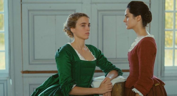
Portrait of a Lady on Fire was a great film. I think more than anything I enjoyed it because it felt so different. Yes, French painting and romance and a dramatic craggy coast suggest a formula, but the reality is that these elements served a higher purpose than simply a love story: they worked in tandem with a great script and thoughtful camera work to produce a surprisingly humorous and touching story not only of romance, but of women and (even as the word feels cliché) sisterhood.


Disclaimer: Though this is an LGBTQ+ story, I recognize that it still speaks to a specific privilege both socioeconomic and racial. There are blind spots in this story, as the understanding of the oppression of one group does not erase the class struggles and other racial inequities present. I still think that this film is worth enjoying, though, because it still speaks broadly to oppression/repression and historic positioning of non-heteronormative sexuality is important.


What most threw me off seeing this film (in a good way!) was the distinct voice of the director and the writing. This film did take itself seriously but at times allowed for some really refreshing comedic moments. These ranged from quippy dialogue to visually clever shots, always keeping me engaged and quite honestly adding a level of unpredictability to the tone. Entering a scene, you never really knew what its purpose was, which was really intriguing in what previously appeared to me to be a straightforward romance.


What was most touching about Portrait of a Lady on Fire is how, for a fair portion of the movie, the main characters are allowed to simply be happy. The audience watches as the two central figures are left to their own devices with the young maid of the house. What results is a really sweet portrait of feminine domesticity–not in terms of a gender role, but rather as a group of women living coexisting in a beautiful way. Of course, there are problems and arguments that arise, but really the three women function as a symbiotic family. Scenes of everyday life are permitted to breathe, taking their sweet time and creating in the viewer this unique feminine vision of harmony, wholly undramatic and wholly human.


I say feminine because the reality is that there are hardly any men acting in this film. It seems as though all the problems in the film, both societal and personal, stem from some unnamed man off screen. And I’m alright with that. I think it is a really interesting way, ultimately, to make a story about women and their real issues without having to explicitly involve the oppressors.


This film speaks to intense internal struggles while also highlighting the beauty and joy that can exist simultaneously with said struggles. I highly recommend it, especially if you’re an artist (those painting shots were gave me such vicarious joy as a painter without access to a studio). If anything, the film is worth it for a beautiful closing long take, one that will long remain in my mind.

REVIEW: Oscar Nominated Shorts – Live Action

I’ll be going through and leaving my thoughts on each of these, though I’d like to say that it is really a shame that “The Neighbors’ Window” won. It was truly the least important and most cliché short of all five. That said, seeing these shorts in a theater setting was really unique and enjoyable and way more immersive than I think possible at home when you’re dealing with short film.


“The Neighbors’ Window”
Marshall Curry

As previously stated, this short was definitely the weakest of the bunch. It had this whiny quality throughout, that specific privileged metropolitan 40-year-old why-did-I-have-kids whining that I am sick of trying to identify with. Of course, the point at the end is for these whiny people to realize how lucky they really are but overall I just felt like the point is no one can be happy. The whole cancer element as a way of introducing hardship into the 20-something couple’s life made me roll my eyes. The visuals of shaving one’s head and getting a hospice bed are just so on the nose I had to wonder if this was a satire.


“Nefta Football Club”
Yves Piat, Damien Megherbi
This is the short that I assumed would win. It was clever, well-paced, and actually made my theater laugh out loud. In contrast to the heavier themes in this category, this short felt like a lighter way to go about serious issues. I highly recommend seeing this one, as it is thoroughly enjoyable both on its surface and in terms of technical cinematography and performance.

“Saria”

Bryan Buckley, Matt Lefebvre
This short was definitely hard to watch. I appreciated this story being told, and the way the camera travels throughout the story was impressive at times. I do feel like there was something missing from this, though. Maybe it was because the setting was something I’ve never seen before or because the ending felt like such a binary evil (though it was, but it verged on cartoonish I might say?), but I felt myself hoping for more contextualization I suppose. It is an important piece of film to see though, especially for US audiences.

“Brotherhood”

Meryam Joobeur, Maria Gracia Turgeon
This short was the most intriguing to me of all of them. Centering on a family whose oldest son is returning from joining ISIS, this short was gritty and touching and made me feel like I was offered a window into a world far away from my own. I highly recommend it.

“A Sister”

Delphine Girard
Finally, this piece was a really strong contender for me as well. It was a study of suspense and solidarity, and was probably the most engrossing of all the shorts. The lighting choices and dialogue specifically made this short a memorable and altogether artistic experience. As a woman works with a emergency line operator, one feels both impending doom and an unrelenting hope at the same time, which makes for a stressful but thought-provoking experience.