REVIEW: “touch” by Ericka Lopez

In most art exhibitions, there’s one rule that should never be broken: don’t touch the art. But visitors to Ericka Lopez’s “touch” at the Institute for the Humanities are not just allowed, but encouraged, to break this taboo.

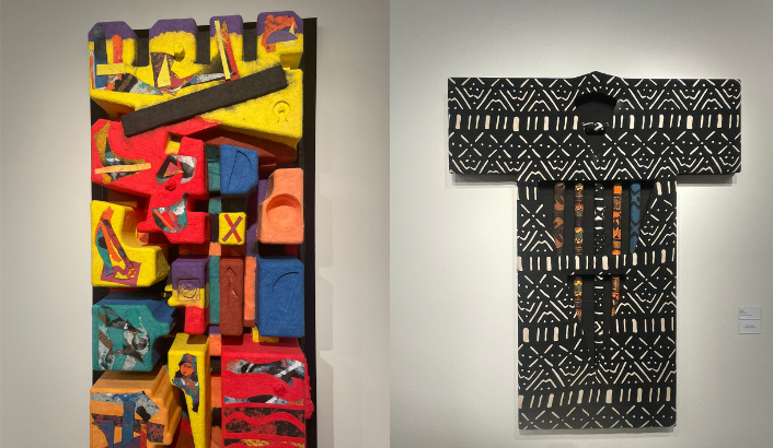
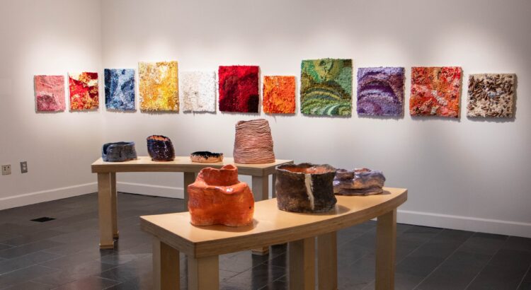
Ericka Lopez is a blind artist who works primarily through touch, and uses her memories of color from before she completely lost her vision to inform her color choices. Her exhibition consists of a mix of textile, ceramic and assemblage works, all of which viewers are “invited to gently touch.” Across the multitude of media, there are many textures to explore.

The punch-rug textile squares, in a rainbow of marbled colors, are shaggy and soft—but sometimes punctuated by beads and buttons, or a particularly scratchy type of yarn. The coil-built ceramic vessels are warped and bent into organic forms, appearing so flexible that I was almost surprised by how solid they felt under my fingers. And the assemblage works, sewn together out of everything from keys to spools of thread to fuzzy balls of yarn, were a surprising mix of textures. Sometimes, running my hand across a collection of beads would create delightful moments of sound as well, contributing to the truly multi-sensory experience.

Details of pieces from Ericka Lopez’s “touch.” Photos by reviewer.

Closing my eyes and exploring the works with only my hands was a lesson in just how nuanced my sense of touch could be. I learned from the textiles that there were many more different kinds of “soft” than I knew how to describe, and from the ceramics that a glossy glaze feels completely different from a matte one.

In her exhibition statement, curator Amanda Krugliak writes that “As visitors to the gallery become active participants, there is the opportunity for deeper human connection beyond surfaces.” It is one thing to be merely a viewer of an artwork, and another to touch it, to rub your fingers through loops of yarn or dangling beads. When my touch shifted an arrangement of keys on one of the assemblage works, I realized that it would be ever-so-slightly different for the next person to enter the gallery. The opportunity to participate in an exhibition in this way, and to be connected to the artwork in the same way that the artist was as she created it, is a rare and precious one.

The exhibition contains multiple features to make Lopez’s artwork accessible to blind and low vision visitors, including braille labels on the walls beside the pieces and QR codes leading to visual descriptions of the artwork. (There are no labels printed in plain text—sighted viewers will have to pick up a paper exhibition catalog just outside the gallery in order to read information about the pieces.) All exhibition materials are also available in both Spanish and English.

While the colors and textures may be visually stunning, pictures don’t do this exhibition justice. Ericka Lopez’s diverse and captivating body of work is best seen—and felt—in person.

“touch” is on view at the Institute for the Humanities Gallery until December 13th. Detailed information about accessibility can be found here.

REVIEW: Through the Lens: The Henry Ford Estate’s Timeless Beauty

The Nature Photography event at the Environmental Interpretive Center on November 14th was an experience I’ll carry with me for a long time. It wasn’t just about wandering the trails of the Henry Ford Estate; it was about seeing this historic space through the eyes of the students who had captured it with their cameras. Their photographs didn’t just frame the estate—they transformed it, revealing a place I thought I knew in ways I hadn’t imagined.

The Henry Ford Mansion . Photo By Alexa Mckray

The student photographs lined the trails like quiet whispers of their perspectives, each one inviting me to pause and see the Henry Ford Mansion in a new light. The mansion, with its stately stone facade and commanding presence, became more than just a historic landmark through their eyes. One photograph caught the mansion bathed in the soft, golden hues of a sunset, the light making the stone seem alive, glowing with warmth.

Another portrayed it on a misty morning, its edges blurred and softened by fog, giving it an ethereal, almost dreamlike quality. Standing there, with the real mansion towering above me and these interpretations surrounding me, I felt like I was experiencing its many layers—its strength, its mystery, its quietness—all at once.

It was in the orchard where the students’ work really resonated with me. Walking among the bare, twisted trees, I stopped at a photograph of the last apple of the season, clinging stubbornly to its branch. Another image focused on the intricate lines of a gnarled trunk, its bark peeling to reveal the scars of time. These moments, frozen through their lenses, made me pause and look closer at the orchard itself—its beauty, its endurance, its history.


Images By Katrina Brown And Kai Richardson

The pond, still and reflective in the late autumn light, was another scene transformed by the students’ photographs. In one, the water was alive with lily pads under the green canopy of summer. In another, it was frozen and dusted with snow, radiating the stillness of winter. Standing there, I felt a deep appreciation for how photography can carry us through time and seasons, reminding us of nature’s constant transformation.

This event wasn’t just about the photographs—it was about the way they made me feel. They invited me to look closer, to see the familiar in a new light, and to connect with the estate in a deeply personal way. Each image wasn’t just a capture of a place but a piece of the student’s perspective, their way of seeing the world.

Walking those trails that day felt like stepping into a conversation—one between the students, the estate, and myself. Their work didn’t just show me the beauty of the Henry Ford Estate; it reminded me how much beauty there is in looking, really looking, at the world around us.

REVIEW: Threads of Justice and Legacy: Lester Johnson Art at the Stamelos Gallery

Visiting the Stamelos Gallery at the Mardigian Library on Monday was a powerful experience that gave me a deeper appreciation for Lester Johnson’s work. Stepping into the space filled with his vibrant pieces, I felt the energy of his journey as an artist, a journey that is deeply rooted in the history and culture of Detroit and the broader African-American experience.

The exhibition, FOUR: Lester Johnson’s Selected Works, is a captivating reflection of his life and creative evolution. As I stood in front of his large-scale totem sculptures, I couldn’t help but think about how Johnson’s work is so deeply connected to his childhood in Detroit’s Westside, a historically rich Black community. Growing up just blocks from the iconic Blue Bird Inn, a hub for jazz legends like John Coltrane and Miles Davis, it’s clear how the rhythms and melodies of Detroit’s jazz scene shaped his creative vision. Johnson’s art is infused with the spirit of this music, often created with it playing in the background, as he seeks to channel its energy and emotion into his sculptures and paintings.

Courtesy of Lester Johnson
26 Wood, Fiber, and Fabric Totems. Courtesy of Lester Johnson

One piece that particularly struck me was the 26 Wood, Fiber, and Fabric Totems, which are a tribute to Rosa Parks and Judge Damon J. Keith. These works, rich in color and texture, tell a story of resilience and community. The fabric, woven with African-inspired patterns, speaks to the ways in which culture can bind people together, even in the face of adversity.

For Johnson, fabric is more than just material—it’s a symbol of the strength and unity that communities, particularly Black communities, have built over time despite systemic challenges. The totems were a poignant reminder of the importance of honoring the past while continuing to fight for justice.

As I walked through the gallery, I was also reminded of how much Johnson’s personal experiences shaped his artistic direction. His move into papermaking in the 1980s, influenced by Al Loving and Lynn Forgach, marked a turning point in his work.

I could sense the new textures and depth in pieces like Lynn’s Song and Nerfetiti, where paper became a medium for exploring his longstanding fascination with primal cultures and natural materials. The three-dimensionality of the work felt so immersive, like I could reach out and touch the cultural stories embedded in the fibers of the paper itself.

Courtesy Of Lester Johnson
Lynn’s Song and Nerfetiti. Courtesy of Lester Johnson


The most moving aspect of Johnson’s work is its ability to connect deeply with the viewer. Each piece tells a story—not just of the artist’s journey, but of the shared human experience. Whether it’s the universal struggle for justice or the celebration of the cultural legacies that shape our lives, Johnson’s art invites us to reflect on what unites us as individuals and as communities. My visit to the Stamelos Gallery was a reminder that art isn’t just about what we see on the surface; it’s about the stories, struggles, and triumphs that are woven into every brushstroke, every piece of fabric, and every sheet of paper. Johnson’s work is a testament to the power of creativity to honor the past and inspire the future.


REVIEW: Arbor Glyph

The Student-led Exhibition Committee is a newly-formed group of Stamps students, faculty and staff who aim to provide more opportunities for undergraduates to exhibit their work. The SEC’s inaugural exhibition “L’Assemblage” was displayed last winter in the Stamps building, and the committee has now brought student work to the walls of the Stamps Gallery with “Arbor Glyph.”

Tucked away in a small side room off the main display space of the Stamps Gallery, “Arbor Glyph” is an understated but cozy exhibition. An inviting semicircle of wooden chairs filled with soft pillows faces the single, large-scale artwork. A carpet softens the tile floor, and black fabric covers the walls. Calm instrumental music, mixed with birdsong, plays softly. The environment feels calm and secluded, a comfortable hiding place.

The artwork itself is a combination of painting and projection, spread across three tall paper panels that form a single image of a chaotic, colorful forest. The painting was created collaboratively by about a dozen Stamps students who attended a painting event in October. Their only direction was the prompt “depict a tree.” This spontaneous method of creation is apparent in the wide range of styles that share space on the canvas, from bold streaks of ink to carefully placed brushstrokes.

As I approached the work to take a closer look, I realized that where my shadow fell onto the wall and blocked the projection, the colors disappeared. I had been aware that there was a projected element to the artwork, but it was so well integrated that I had failed to notice that the painting was composed with only black ink. The colors of the piece are an illusion produced by the projector overlay, bringing vibrancy to the shades of gray.

Arbor Glyph, detail. Shadows cast onto the artwork reveal the shades of gray beneath the colorful projection.

The longer I looked at the piece, the more small details I noticed. Apples among a tree’s scribbled branches. Birds in the sky. Animals lying beneath the trees, sheltered by their branches. Mushrooms growing in the undergrowth. These details added subtlety and life to the scene. I also noticed that the colors of the projection seemed to shift over time, particularly the sky, which cycled through blues, greens and purples.

The artwork and the space encourage this kind of contemplation—I found the chairs comfortable and the music very calming. The small room felt like a peaceful refuge, and I was content to spend a long time with the piece, watching the colors slowly shift.

I enjoyed the exhibition itself, but to me, the most valuable aspect of “Arbor Glyph” is the mission it represents. While there are existing opportunities for Stamps students to exhibit their artwork in the Stamps Gallery, such as the Undergraduate Juried Exhibition, those opportunities tend to be very selective and set a high bar for entry. There is value in recognizing exceptional work, but there is also value in creating space for work that might not otherwise have the chance to be publicly displayed. The Student-led Exhibition Committee is creating exhibition opportunities that are more accessible for students, and for that I applaud them.

“Arbor Glyph” is on display at the Stamps Gallery until November 16th.

REVIEW: The Music of John Williams

On Saturday, October 19, I attended the Ann Arbor Symphony Orchestra (A2SO) concert celebrating the music of John Williams. As expected, given the popularity of one of cinema’s greatest composers, the line at the Michigan Theatre was incredible—possibly the longest I’ve ever seen for an A2SO concert. The crowd was notably diverse, with attendees of all ages, and I even recognized friends who don’t typically attend orchestra performances.

Under the baton of guest conductor Damon Gupton, the program showcased some of John Williams’ most famous works. The first half, in program order, included “Superman March” from Superman, “The Shark Theme” from Jaws, the main themes from Jurassic Park and Schindler’s List, “Devil’s Dance” from The Witches of Eastwick, “Love Theme” from Superman, and the “Throne Room & End Title” from Star Wars: Episode IV – A New Hope.

I loved seeing some musicians—and even some instruments—in costume on stage. Paired with the quick beat and lively brass in “Superman March,” it set high expectations from the start that this would be a fun and exciting concert. Damon Gupton’s theatrical side shone through as he conducted the iconic, suspenseful opening measures of “The Shark Theme.” With each new phrase in the music, he would glance apprehensively behind him, as if watching out for danger lurking—an amusing touch that drew laughter and reflected his background as an actor. 

The order in which the repertoire was performed made me feel as though I were watching a movie, with each piece shifting the tone and taking me in a new direction. After Jaws, the uplifting main theme from Jurassic Park brought excitement, followed by the somber theme from Schindler’s List, which featured a sorrowful violin solo by the concertmaster. “Devil’s Dance” then introduced a thrilling energy that transitioned seamlessly into the sweet melody of “Love Theme,” before the first half concluded with the universally recognizable soundtrack from Star Wars.

The orchestra also performed the Olympic Fanfare and Theme, “Harry’s Wondrous World” from Harry Potter and the Sorcerer’s Stone, “Hymn to the Fallen” from Saving Private Ryan, “March” from 1941, “With Malice Toward None” from Lincoln, and finished the evening with “Adventures on Earth” from E.T. the Extra-Terrestrial. 

Since I haven’t seen the films Olympic Fanfare and Theme, “March,” and “With Malice Toward None” come from, I had never heard them before. This allowed me to fully absorb the emotions conveyed by the music, without the influence of imagery associated with the movies. The catchy rhythms and bright trumpets in Olympic Fanfare and Theme and “March” made it easy to visualize social festivities. Meanwhile, the strings in “With Malice Toward None” evoked a strong bittersweet feeling. 

On the other hand, I’ve already heard “Harry’s Wondrous World,” “Hymn to the Fallen,” and “Adventures on Earth” performed live by the Michigan Pops Orchestra (MPO), who also played the same versions of “The Shark Theme,” themes from Jurassic Park, and Star Wars from the first half of the concert. It was interesting to compare how the A2SO and MPO interpreted these musical scores. The MPO has a much larger string section, which allowed their strings to stand out more, while the winds shined more in the A2SO. Though each had a different dynamic, this experience only deepened my admiration for our school’s student orchestras, as I didn’t find them lacking in musical quality compared to a professional ensemble.

Overall, with its diverse selection of pieces, the Ann Arbor Symphony Orchestra’s performance felt like watching a film without the visuals, beautifully celebrating the genius of John Williams.

Pictures are provided by A2SO

REVIEW: Silver Linings

Spelman College is a historically Black women’s college in Atlanta, Georgia, which holds an art collection spanning over 100 years of African American artwork. “Silver Linings” brings a sampling of this historic collection to the walls of UMMA.

The exhibition includes 40 works from the Spelman Collection, a wide sampling that represents a slice of the history, experiences and aesthetics of Black Americans in the last hundred years. It features a few local connections as well, including several works by Beverly Buchanan, who spent the later years of her life in Ann Arbor.

There are some truly illustrious artists included in the exhibition, both historical and contemporary. I was excited to see a piece by Faith Ringgold, an artist whose work I have studied in depth. She is well known for her “story quilts” and similar pieces combining painting with textiles, often inspired by her childhood in the heart of the Harlem Renaissance. “Groovin’ High,” titled after a track by famous jazz musician Dizzy Gillespie, is a rhythmic and joyous scene of Harlem nightlife. It also serves as a demonstration of the artistic and historical significance of this collection.

The exhibition is largely organized into categories such as photography, portraiture and abstraction, with some works standing alone. I found the effect a bit disjointed, with no clear path to lead me through the gallery and no overarching story connecting different areas of the exhibition. However, a collection as broad as this one is best displayed with a diverse range of works and topics, so it is understandable that curatorial emphasis was placed on several smaller groupings of work around different themes.

Of all the works in “Silver Linings,” I was particularly drawn to the ornate mixed media works of Lina Iris Viktor in the “Portraiture and Subversion” section. Her work combines photographs with ink, paint and pure gold. She captures Black female bodies in lush, dark compositions, filled with deep shadows, with only soft highlights and bright accents of gold to distinguish the figures from their surroundings. These were visually stunning celebrations of the beauty of Blackness, skillfully subverting racist and colorist tropes.

Betty Blayton, “Vibes Penetrated.” 1983, acrylic on canvas. Image via Neil Kagerer and UMMA.

I also enjoyed the works in the “Abstraction” section of the exhibition. Betty Blayton’s “Vibes Penetrated,” the huge circular painting used in marketing materials for the exhibition, is even more stunning in person. The exhibition text references Blayton’s intention to create a “meditative pause,” which I felt as I lingered in front of it—the composition is active yet calm, and I felt that I could have stared at it for hours. Another highlight of this section were the luminous paintings of Michigan alumna Lucille Malkia Roberts (MFA 1939). Her works “Out of the Blues” and “Winter Sun” used beautiful complimentary colors and expressive brushwork that felt joyful and bright.

I did not love every single piece in “Silver Linings,” but I found several that spoke to me. Any exhibition with such a broad variety of work can never be a perfect fit for one individual’s taste. That breadth, however, means there is room for many different kinds of people to find an artwork they connect to. Others may find that their favorite works are very different from mine, but there is something for everyone in “Silver Linings.”

“Silver Linings” is on display at UMMA until January 5th. An exhibition tour by guest curator and History of Art professor julia elizabeth neal will occur on November 10th.