REVIEW: Threads of Justice and Legacy: Lester Johnson Art at the Stamelos Gallery

Visiting the Stamelos Gallery at the Mardigian Library on Monday was a powerful experience that gave me a deeper appreciation for Lester Johnson’s work. Stepping into the space filled with his vibrant pieces, I felt the energy of his journey as an artist, a journey that is deeply rooted in the history and culture of Detroit and the broader African-American experience.

The exhibition, FOUR: Lester Johnson’s Selected Works, is a captivating reflection of his life and creative evolution. As I stood in front of his large-scale totem sculptures, I couldn’t help but think about how Johnson’s work is so deeply connected to his childhood in Detroit’s Westside, a historically rich Black community. Growing up just blocks from the iconic Blue Bird Inn, a hub for jazz legends like John Coltrane and Miles Davis, it’s clear how the rhythms and melodies of Detroit’s jazz scene shaped his creative vision. Johnson’s art is infused with the spirit of this music, often created with it playing in the background, as he seeks to channel its energy and emotion into his sculptures and paintings.

Courtesy of Lester Johnson
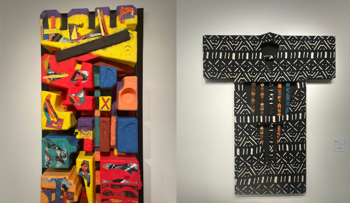
26 Wood, Fiber, and Fabric Totems. Courtesy of Lester Johnson

One piece that particularly struck me was the 26 Wood, Fiber, and Fabric Totems, which are a tribute to Rosa Parks and Judge Damon J. Keith. These works, rich in color and texture, tell a story of resilience and community. The fabric, woven with African-inspired patterns, speaks to the ways in which culture can bind people together, even in the face of adversity.

For Johnson, fabric is more than just material—it’s a symbol of the strength and unity that communities, particularly Black communities, have built over time despite systemic challenges. The totems were a poignant reminder of the importance of honoring the past while continuing to fight for justice.

As I walked through the gallery, I was also reminded of how much Johnson’s personal experiences shaped his artistic direction. His move into papermaking in the 1980s, influenced by Al Loving and Lynn Forgach, marked a turning point in his work.

I could sense the new textures and depth in pieces like Lynn’s Song and Nerfetiti, where paper became a medium for exploring his longstanding fascination with primal cultures and natural materials. The three-dimensionality of the work felt so immersive, like I could reach out and touch the cultural stories embedded in the fibers of the paper itself.

Courtesy Of Lester Johnson
Lynn’s Song and Nerfetiti. Courtesy of Lester Johnson


The most moving aspect of Johnson’s work is its ability to connect deeply with the viewer. Each piece tells a story—not just of the artist’s journey, but of the shared human experience. Whether it’s the universal struggle for justice or the celebration of the cultural legacies that shape our lives, Johnson’s art invites us to reflect on what unites us as individuals and as communities. My visit to the Stamelos Gallery was a reminder that art isn’t just about what we see on the surface; it’s about the stories, struggles, and triumphs that are woven into every brushstroke, every piece of fabric, and every sheet of paper. Johnson’s work is a testament to the power of creativity to honor the past and inspire the future.


REVIEW: A Little Night Music

A Little Night Music, based off of the movie Smiles of a Summer Night, was an exciting and jaw-dropping musical full of plot twists and shocking revelations that uses humor, song, and dance to portray infidelity as a romantic comedy. Set in 1900 Sweden, the story revolves around a messy love web between a lawyer, Fredrik Egerman; Fredrik’s wife, Anne; a famous traveling actress, Desirée Armfeldt; Desirée’s lover, Count Carl-Magnus Malcom; and the Count’s wife, Charlotte.

The drama between the characters shows the darker side of romance in a sarcastically endearing way. The men are ungrateful towards their partners but down bad for Desirée, which is what generates the jealousy that pushes the plot forward in unexpected ways. The entire time I was on the edge of my seat, uncertain where the story was taking me. The ending was bizarre yet satisfying: happy yet bittersweet. Afterwards, I had a lot of fun talking to my friend about all of the twists and turns in A Little Night Music, which for me is what set it apart from the other musicals I’ve watched. It was a story completely different from what I expected when reading the description of the plot online.

The students really brought this show to life; their voices perfectly replicated the classic European noble accent. The wardrobe was gorgeous, particularly Desirée’s deep red dress and Charlotte’s dark blue dress, a contrast that hints at their differences and heavy animosity. I was also very impressed by the live playing of the cello and piano on stage, as it was my first time seeing instruments played on stage by the actors and not by the musicians in the pit orchestra. Especially the student who portrayed Fredrik’s son, Henrik, who played the cello with a very good tone and vibrato. 

My favorite song would be “Send in the Clowns,” sung by Desirée as she discovers that love doesn’t always go as predicted. The lyrics were relatable and the emotion in her voice mirrors lots of the experiences people face in romance today. This is the last musical I’ll see this semester and was a fun one to review. If you’re looking for something to betray your expectations, then A Little Night Music is for you!

REVIEW: Alexandra Collins’s “Hyper Light”

Seeing Stars with Alexandra Collins’s Exuberant “Hyper Light”. 

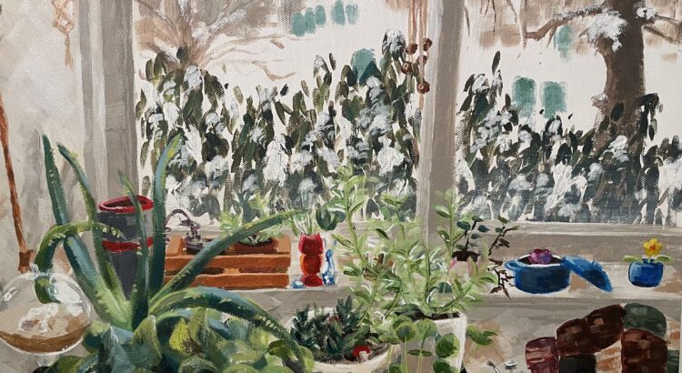
On Friday February 16th, I had the pleasure of attending the opening reception of Stamps senior Alexandra Collins’s first solo exhibition “Hyper Light ”. The work is on display at The Common Cup, an Ann Arbor coffee shop on Washtenaw Avenue.  From still lifes of jello molds and glassware, to large zinging abstracts of flowers and shapes, the series is a colorful and bold exploration of the relationship between energy and tension.

“Red Jello on Purple Tablecloth”

Collins’s eye finds movement in stillness. Investigating the organic in the inorganic, she uses bold colors and streaky light to create energetic portraits of jello and glass. The tension between energy and stillness holds as a focal point in her still lifes like the horizon of a sea scape. The lively dynamic style contrasts and emphasizes the stillness of the subjects like a loud silence. Maybe you shouldn’t have ordered that second Mayan Mocha, or maybe you caught the jello jiggling from the corner of your eye.


“Superbloom”

Collins plays with the constraints of the canvas, in some works lining up several panels, in others tacking panels on in unexpected ways. The larger and more abstract pieces expand and challenge what can contain them. Pieces such as “Superbloom” are colorful menageries of plant life, bubbles and baubles, and streaks of light. Reminiscent of exploding stars and streaking galaxies, the arrangements represent a synthesis of color, shape, and form. The flowers are closed, and the paint around them vibrates and thrusts and sings like it just can’t be held anymore. Like the build up of a song with no release, we are held in those moments before explosion.

On a blustery February day, the basement location of the exhibition makes the colorful paintings feel like an underground secret, like spring charging beneath the earth. I felt a celebration and investigation of the feminine in the flower motifs and dining room still lifes. The celestial exuberance and energetic synthesis of shapes and color asking what feminine energy might look like, and where we could put it down. When I parked at a table for a few hours to sip coffee and send out piles of resumes and cover letters, I felt Hyper Lights hum resonating around me, not with the glory of the finish line, but with potential.

“Supernova”

“Hyper Light” will be on display at The Common Cup on Washtenaw Avenue for about two more weeks, until March 2nd. The paintings are an energetic and possibility expanding presence in the cafe, which is a great place to study or meet with friends. You can find more of Collins’s work on her website and instagram, or by attending Commence, a graduating senior exhibition held at the Stamps Gallery in April.


REVIEW: How to Build a Disaster Proof House

Tracey Snelling’s ‘How to Build a Disaster Proof House’ is on exhibition in Institute for the Humanities’ Gallery and Osterman Common Room. The exhibition itself is not huge – one can definitely squish it into their lunch or dinner time as an after-lunch/dinner art experience. I recommend doing so – this is an interesting exhibition where everyone will find different things to focus on and to muse that will definitely be worth your time.

The exhibition is mainly comprised of different styles of rooms, some small and some real-life sizes. There is no common theme shared in their aesthetics, and each and every one of them is decorated with vibrantly colored objects and cut-outs from prints. They seem to represent different lifestyles, or even, different scenes from life. However, they have kitsch, even a bit eerie, or extraordinary atmosphere. They do not fall into what we would mentally categorize as ‘normal life’. The feeling of wild, chaotic energy seems to derive firstly from the background, as the artist had placed huge posters or drapes of natural sceneries on the walls of the space, forming a background that adds energy to the exhibition. As can be seen from some pictures, these sceneries are not the ones that calm your mind. The colors in it are exaggerated and overly vibrant, adding to the active, uneasy vibe of the exhibition. Also, the use of diverse materials and colors for objects that demands attention all at once also adds to the vast input of information from the exhibition. Additionally, the placement of the artworks that place life-size rooms and miniature-size rooms together also creates unbalance in the scope of the attention: while the viewer is focusing on the smaller size works, their attention is overwhelmed by the relatively huge, life-size objects while the small ones nag and demands attention while they are taking in the life-size ones, creating the uneasy tension between the two sizes. Lastly, the artist had interestingly integrated video into her work-lots of videos are played simultaneously from the windows of small houses, adding chaotic audio on top of all the rich visual information that the viewer is already processing. All this adds up to create an audiovisual influx of information and this is where the exhibition consisted of static rooms filled with un-moving objects shifting into the concept of moving and alertness in disastrous situations. When in a situation of a disaster, people are more alert toward inputs from the world to detect danger and this overwhelms them. The exhibition creates a similar experience for us while reminding us that disaster is different from mundane life but perhaps not so far apart – this is expressed by how the artist chose the area that we are familiar with, personal rooms, but filled it with items and contexts that are not common.

There were also a few rooms where I could detect the trial to bring in social messages and status quo, like in the picture above. However, that was not emphasized much, and like it was addressed above, I think the author did a creative take on explaining disaster without using direct reference from society.

REVIEW: How to Build a Disaster Proof House

How to Build a Disaster Proof Home is the latest installation at the Institute for the Humanities on campus. Artist Tracey Snelling transforms the space into an explosion of color, sound, and texture as various home interiors occupy the room. Working both on a life-scale and a miniature scale, Snelling presents an exploration of what home really means and how one mentally and physically finds refuge in the contemporary world.

I’d like to examine this exhibit in a bit of a fractured way, pinpointing and elaborating upon various aspects as these come together to create the complete multisensory experience of Snelling’s work. Firstly–the aural. Before you even enter the space, you can hear a variety of monologues, sound effects, and music. This is because almost every section, or constructed home, has accompanying audio materials. Whether that’s a series of films being played all at once, or Duran Duran filling up a corner of the space, there’s a sense of the place being alive. The weaving together of sounds (the less delicate may call it a cacophony) create an entirely new sonic experience, one where the simulation of human presence is achieved. This simulation has both the comfort of a TV left on in the living room and eeriness of interacting with Siri or other faux-human presences. 

The same kind of aural complexity exists in the textures of the space. You find the tactile, familiar comfort of a worn rug juxtaposed with the tackiness, insincerity, and flatness of an idealized sunset-rainbow-beach wallpaper. There’s a dedication to different temporalities here, as a portrait in 70’s fashion hangs above a cherry red plush carpet circa the year 2000. The melange of these tributes to homes of past decades is fun and very carefully coordinated to maintain coherency, but there’s also a deeper, more touching and humanistic idea at the core of how we maintain familiarity and keep the things that we treasure most close to us (even if that’s the flimsy metaphor of hope behind a rainbow).


Finally, the color is alluring. Bright tones, eye-catching patterns, and iridescent touches are not only attractive, but add a very specific voice to the message of this exhibition. Ultimately, How to Build a Disaster Proof House is a sensory delight that makes you appreciate wherever you call home.

REVIEW: Quilts in the DUDE

The Duderstadt Gallery located between the Duderstadt Library and Pierpont Commons has always caught my attention. With the school of art and design being one building and the school of music theater and dance being up a hill from the main part of North, it is an island of art in a sea of engineering. The Duderstadt Gallery has open doors that invite anyone walking past to wander in. Currently, the doors look more inviting than usual with quilts hanging inside ready to invite students into their warm embrace. 

From March 6th to 15th, the Duderstadt Center Gallery is filled with lovely hand stitched quilts made by the Faculty Women’s Club in the “Stitched Together” FWC Centennial Quilting Exhibition. It is slightly ironic that such traditionally feminine art is displayed at the heart of North Campus, where the majority of students are engineering students and engineering classes sometimes have more Stevens in a class than women. However, it is a wonderful display of handmade quilts that reminds anyone who walks through of a missed loved one who has wrapped them in a tight hug. 


I do not know the specifics of the Faculty Women’s Club. However, one quilt speaks of the closeness of the group. Angie Nagle Miller’s Birthday Signatures features squares made from the group for her 50th birthday. She then completed a quilt for her 70th birthday which is now on display. This quilt not only highlights how close and supportive the group is of each other, but of the longevity of the group. 

The size, themes, and colors of the quilts are as varied as a basket of fruit. Standing in front of these quilts is a lesson in color, texture, and pattern. Each of which has a unique personality and the heart of the maker sewn into it. The reason behind each of these quilts is different. For example, the Safe House Quilt was made by the group to be donated to people who come to the “Safe house”, Laura’s Quilt was made for Laura on her diagnosis of cancer, and some were made for a challenge. However all the quilts demonstrate the caring hand and passion of the maker.


There are so many beautiful quilts designed by talented artists and craftswomen on display that I have not mentioned. I would highly recommend checking out the “Stitched Together Exhibition”.