Frame by Frame: Light

I decided I wanted to add an extra scene to the first section of my animation to improve narrative cohesion. I wanted to show the light from the house physically interacting with the character, that way when it appears later in the animation, it can serve as a visual representation of being ‘haunted’. This also gave me a chance to explore how I want light to look as it moves. I used a brush with lower opacity to have reflections of the light shifting against the character as well as the environment. Being a non-physical entity, I wanted the light to change shape in every frame to give it that quality.
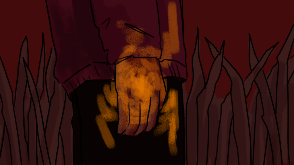
I have also been getting used to keeping better track of my layers, and how to get the most use out of each frame that I draw. For instance for this scene, I created two backgrounds of grass, and alternated between the two while adding new movement to the light. This gave the impression of the grass blowing in the wind while still maintaining focus on the light. I was able to finish the first section of my animation this week! My progress is shown below:

Frame by Frame: Wind

This week I began working on animating the first scene of my project. The scene is primarily composed of establishing shots, so the main movement I needed to create was caused by the wind. My process consists of diving layers into their moving parts: ie. grass 1, shading 1, hair 1, color 1, saving that as a frame, then minimizing the opacity of these layers and drawing a new frame over top. The main difficulties I encountered were trying to create overall cohesive movements throughout this process and managing all the layers I was working on simultaneously. I noticed after edited together all the frames that there were certain layers I forgot to include when saving, which is something I’ll needed to return to fix later. Overall though, I’d say this process works fairly efficiently and I’m excited to continue experimenting with movement in later scenes! My progress so far is embedded below:


Frame by Frame: Backgrounds

This week I got started on drawing the first scene of my animation. Specifically, the backdrops needed to animate the first scene (pictured below). As I began this process, I realized there was a lot to consider in terms of color palette, brush settings, how to maintain style consistency, etc.. I decided for this specific scene to have a dark red color palette, cut by a lighter orange for the light inside the house. Since this first scene is meant to exist in a dream-like/non-reality plane of existence, dramatic colors and extreme shadows will fit the tone I’m looking for. I’ll maintain this palette for this first and the last scene which take place in the same location, but use a cooler toned palette for the scenes grounded in reality. I also began experimenting with animating movement of the grass, and am working out the most efficient method to achieve the look I want. Currently, I am drawing scenes in photoshop and exporting them into Adobe Animate. By next week I hope to have completed scene 1!

Frame by Frame: Writing & Storyboarding

This week I focused on streamlining my animation’s story by breaking down my outline into scenes, and then sketching them out into storyboards.

I have always loved horror movies that leaned towards surreal, and how they’re able to aestheticize typically scary or creepy imagery. For my short film I wanted to write a ghost story, and create a sense of the surreal/the uncanny through the visuals and sound effects. I think ghost stories are easy ways to explore a character or an idea through a supernatural medium. For instance, what else can you be haunted by other than ghosts? Memories? Bad thoughts? Other people? My ghost story focuses on the pitfalls of perfectionism and conflict with the inner-self. After writing out a rough script, including scenes I knew I wanted in the film, I re-wrote it to tell a more cohesive story. Keeping in mind the time it will take to animate each scene and action, I made sure to be very specific in what movements would occur and why. Transferring my writing to a storyboard felt key in order to really think about the best way to visualize the story. What angles feel the most dramatic, do the cuts from one scene to another feel cohesive enough, how many backgrounds will in I need to draw? Now that I have the basic outlines set, I can begin to plan out how to best complete this project!

Storyboard:


Script:

Read More

The Jukebox: Cosmic Freeway

Lyrics from “Cosmic Freeway” by Yeek. “Cosmic Freeway” is the last track on Yeek‘s 2017 album, “Sebastian”. Each one of his worries described in the verses of this song are followed up by the chorus: “At the end of it all, I’ll be speeding on the cosmic freeway”, taking a distant reflective look on all these stressors to say, what does it really matter?

The Jukebox: Where Did The Time Go?

Lyrics from Where Did the Time Go? by “Lord Huron”. This song seems to act as a mini conclusion in Lord Huron’s album Long Lost, as he transitions from sadder, melancholic songs to a more upbeat one. I like to think of this short, one-verse song as a means of beginning again. The narrator is reflecting on their life, and despite the lost and grief they tell in prior tracts on the album, say that their time has been well spent. I think this sense of gratitude towards the past yet continuing on to the future is especially relevant as another semester comes to an end. The visuals for this comic come from some summertime memories!