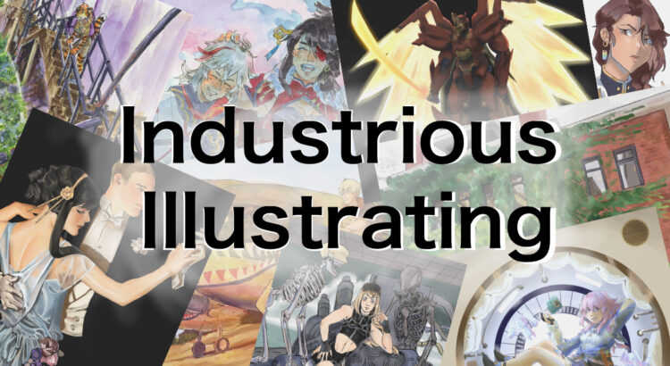
Welcome back to Letters by Lydia! This week I’m gonna give you all a rundown of something called ribbon lettering, which looks a little something like this (you might recognize that last picture from last week!):


In my opinion, the easiest way to do ribbon lettering is to use something most you probably already have: a highlighter. My personal favorites are the zebra mildliners, but any old highlighter with a chisel tip like this will do!  When it comes to actually using this technique, the first thing you need to do is make sure you’re holding the highlighter the right way. Instead of holding it like you would to highlight a something, where it draws a thick line horizontally, you want it to be the opposite way; once you’ve rotated your pen so you’re holding it correctly, it will draw a thin horizontal line and a thick vertical line. Then you can start writing! You want to keep your pen oriented that same way the whole time, because that’s what will give you this kind of 3D/layered ribbon effect. Another tip is to keep your strokes simple, especially when you’re first starting out. For example, instead of writing a lowercase “a” like you would in your normal handwriting, it might be easier to write it as a circle connected to a vertical line.
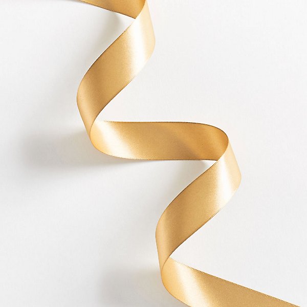 The next step is figuring out the “layers”, so to speak. For this part, it’s super helpful to think of what an actual ribbon would look like. In this photo I got from the Papersource website, you get a really good sense of what I mean by the layers of the ribbon.When trying to figure this out with your own letters, you want to look for junctions where there’s some overlap, which I tried to illustrate in the diagrams below. For ribbon lettering, there are a ton of options in terms of style, so you can either outline the sections of each letter, color in the “shadowy” parts, or do both! I showed both examples so you can get a sense of how they each work.


Once you feel comfortable with that, you’re pretty much good to go! This is definitely one of those things that gets easier with practice. I love doing this kind of lettering because it’s very formulaic and reliable, so it’s nice to use for notes headings or things like that, as well as some mind-numbing doodling. That said, there are a lot of options to spice it up! I illustrated a few below–as you can see, you can do this by just outlining the sections, or coloring in the shadowy parts, or both, like I mentioned before. But you can also do this in cursive or in print, outline and color in the shadows with the same color, a different color from your base, or a different color entirely. The options are really fun to play around with, so once you get the basics of it, enjoy playing around with all the different options!

Hopefully this was educational and made at least some sense! Please feel free to leave any other questions you have, and have a lovely week!


 Making love under the moon. It’s something lovers do. Every time I think I know where you end and where you begin. It slithers from my grasp. You know how to make me focus. On being enthralled by you. Even after we’re tired after hours of vibrant affection. You still turn my head. Roll it against the pillow. To you. The moon rises above you. Ethereal. I can’t help but think the moon must have blessed me with you. As lovers do.