Why is the UMMA so difficult to navigate?? If you aren’t looking at one of the main exhibits it is just a maze of half levels and random staircases. However, if you manage to find your way through and follow the signs for the Buddhism exhibit, you will find the Power family’s Inuit art collection. It is a fairly small collection, filling on room comfortably. Everything is one of two media, prints or sculptures. The first piece I saw entering the exhibit was a sculpture of two intertwined narwals with their bodes carved out of a beautiful, blueish granite and their horns out of ivory. This was probably the largest of the sculptures and certainly held a place of honor. I really like multi media sculptures; Degas’ dancer sculptures have always been favorites of mine as he uses ribbon and tulle to create a more realistic, and textural representation of his subjects. The Inuit sculptures utilized a similar technique by using ivory and horn to represent tusks, teeth, and horns on their sculptures. This added something extra to the art and made it feel connected with the real life animals that they represented.
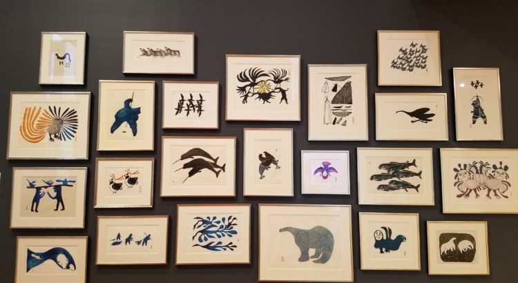
The other art form featured in the exhibit was prints. The gallery wall featured some twenty, framed prints of various hues and subject matter arranged on one wall together. Next to the gallery wall was a stone print block for one of the prints on the wall. I generally think of prints being carved on wooden blocks or maybe a plastic like vinyl but many of these prints were carved into stone or ivory. The prints on the wall mainly featured animals and fed into the general hue of the room as many were printed in black or shades of blue while the sculptures were mainly carved out of stone on the black and blue color spectrums. The prints were interesting individually but also as a collection altogether. Many of the prints featuring birds were at the top while polar bears were at the bottom. To my mind, they were roughly arranged so as to put predators at the bottom and prey at the top. Two prints in particular were placed alongside each other creating a story. One print featured a flock of birds while the print next to it featured a smaller flock of similar birds and a hunter with a bow pointed at the birds above them. This interplay between the prints really displayed the beauty of good curation as those prints did not seem to be made by the same artist or necessarily intended as a pair but added something to the gallery when featured as such.


