REVIEW: BoxFest Detroit Film Festival

It’s early and my tea is still warm. At this point in my life, waking up before 9 AM makes me feel like I’m a child again, watching the day start and letting each breath fill me with the hope of a ripe new day. The fun things happen late at night, but the beautiful ones happen just after the sun rises, when the day hasn’t yet accumulated any of the complexities that come with time. It’s also the perfect time to watch amateur films.

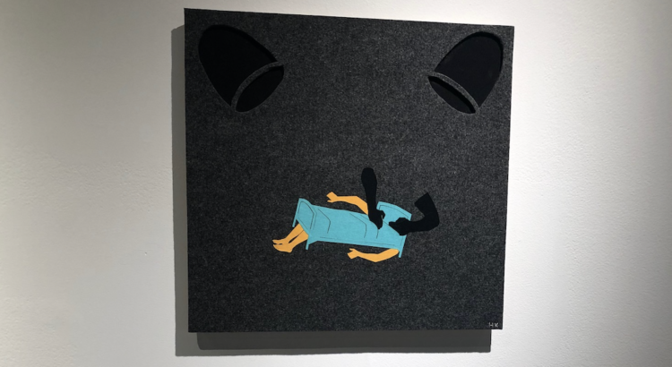
I click play to begin the BoxFest Detroit Film Festival, a contest that has for the last 16 years served as a platform for up-and-coming women directors. This section is “Box 3” a set of 5 narrative short films.  First up is an animated short, Chatterboxing!: it’s delightful, it’s funny, and it combines drawn animation with photographed objects to create a lively, kinetic verbal-boxing match. Chatterboxing! is a clean high compared to the rest of the films; it’s something that might be featured as a Disney short. And it lures us into a kind of false sense of security.

The other four films do not have the luxury of animation’s universal simplicity. The rest are live-action and thus much more susceptible to all the technical shortcomings of low-budget films. A Basement Film, the longest piece of the event—and the most emblematic of the low-budget genre—is plagued with distorted sound, strangely delivered lines, and no color-grading. So, what are we left with? Story. Without the traditional pleasures of mainstream film aesthetics, narrative eclipses all else. We must force our way into the narrative like a benevolent intruder, searching the narrative for any signs of life. We’re looters who have shown up to the party a little too late, and we must be content with any useful thing we find.

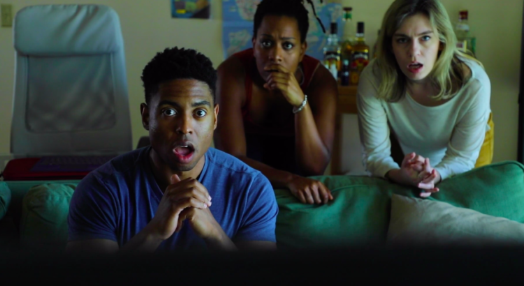
When everything else is stripped away, A Basement Film is a surprisingly close-to-home vignette about a girl who struggles with her mental illness during a basement hangout. The dialogue falls short and the camera lingers a bit too long after someone speaks, but we truly get a film about the culture of the basement, complete with meandering conversations about the future, awkward groping, and psychedelics. It feels honest, even if it feels rough around the edges—really, because it feels rough around the edges. Even the over-lingering shots seem to reveal the little moments of silence that make real life so uncomfortably real. So, when A Basement Film does a character well, that character feels especially done well. The stoner guy who’s actually really smart but is content working his blue-collar job and learning about drugs on the internet—that’s some variation of someone a lot of us have met. And this same sincerity applies to the remaining three films, whether we’re watching a video game possess two boys, the apocalypse test a couple’s relationship, or a group of teenagers navigate the intersection between faith and blackness.

Really, the best thing about low budget films is how little people care about them. When a student film begins and one hears the deafening roar of a camera’s internal microphone (God forbid), most people check-out. After all, film is a mixed-media, comprised of sound, photography, and story. If a movie can’t hold up its end of the bargain in providing you all those elements, why watch? We know what it takes for a movie to be entertaining, and we expect that standard to be met. But, when we go beyond our expectations to be entertained—or, more aptly, below them—we stumble upon the little kernels of beauty that often go unnoticed in a polished Hollywood film. There’s a freedom in it, to portray something simple without the control of a studio that needs to turn a profit. Rather than grimace at the faults of these amateur films, I revere them because they give me a little bit of hope that there are still young people out there doing the work of stumbling in the dark to find good art. And hey, you’re bound to stumble onto something, someday.


I drain my tea and look for something productive to do.

REVIEW: Real and Imagined: Fabric Works and Video Animations by Heidi Kumao

I walked into the gallery with a stomach ache, and walked out with an even bigger knot.

Heidi Kumao has put together an excellent portrayal of the gaps in justice systems in cases of sexual violence. It is often characterized as a short list of events, identifiable with clear beginnings and ends. We know who the players are (we call them aggressors, rapists, victims) and what should happen to each party after the event has occurred (getting fired, jail time, police report, testifying). We know what counts and what doesn’t, and what responses are valid. Of course, none of this is actually true; there are countless ways in which someone can be affected by sexual violence, and to reduce such experiences down to more easily digestible stories is a powerful insult, putting into question a violated person’s reality.

The layout of Kumao’s pieces is minimalistic on purpose, each stitch and fabric scrap made infinitely more intentional. And while the arrows on the floor (to direct single-direction traffic in the gallery, allowing for social distancing) were not a part of the exhibition, they fit the theme: there is one way to reconcile with and bring justice to sexual violence. It’s procedural.

A textile medium was an inspired choice: fabric is manufactured neat and orderly, but on close inspection it has a propensity to unravel, to knot, to incorporate impurities, to lasso in sharp burrs, to tangle. It has holes in it, all over the place, it’s easily pierceable, complicated, diverse in stitch and texture. Lint and fuzz make abrasion evident, stains remain embedded. It calls up thoughts of bedding and thus the fiction of dreams, as the exhibition title suggests. It’s also representative of traditional womens’ work: sewing, mending, weaving, embroidering.

Her motifs capture well the double-edged properties of gaining a platform for self-advocation. Thechair is a seeming promise of a seat at the table, but it always comes paired with a spotlight, and an audience (the Langston Hughes reference is intentional, given the added layer of opposition  that women of color face in their search for justice). Connections are tenuous threads, which grow into chaotic knots and simplify into lines, noting the difference between reality (complex stories, lasting results, diverse reactions) and the imagined (straightforward descriptions, single narratives).

The most poignant piece to me was one called “Reluctant Narrator,” a little square scrap of felt maybe six inches wide. One chair sits with another, a tangle of thread upon it, which the other chair is pulling into a thick, straight line. 

It’s become the norm to accept heroism only in those able and willing to share their trauma with strangers, putting themselves on a stage and accepting skepticism and hatred in exchange for benefitting the good of others. We welcome the poised, and lack respect for the silent.

The exhibition will be on display until December 4th. The gallery is open 2-7pm Tuesdays and Fridays to anyone with an Mcard; unfortunately, they’re not presently able to open to the public. However, they have a wealth of online resources like discussions with their featured artists and news about goings-on in the Ann Arbor art scene on their website, https://stamps.umich.edu/.

REVIEW: Real and Imagined

Professor Heidi Kumao’s solo exhibition features fabric works and experimental animations that capture ordinary conversations and relationships. What sets Professor Kumao’s work apart from other artwork exploring a similar concept is not only the unique medium, but also the fact her work is told from a feminist perspective. She explores underlying emotions and tensions in everyday interactions by representing trauma and power imbalance. The title, Real and Imagined, reflects public support for and backlash towards women who have spoken up about assault, harassment, and misconduct. A woman’s experience can be believed to be an honest account but dismissed as wrongly remembered or entirely made up.

Professor Kumao’s work is minimalistic, but her work is far from lacking meaning or appearing overly simplistic and therefore unclear. Her work is almost playful or childlike – the style is reminiscent of something you’d see in a picture book. However, the seemingly innocent appearance of Professor Kumao’s artwork is sharply contrasted by how effectively she is able to convey emotion in her work.

For example, in the above piece titled “Consultation,” we see what is unmistakably a gynecologist’s office, with the door, chair, and the exam chair with stirrups. Although there are only really three focal points in the piece, with the background being all white, Professor Kumao was able to clearly set the scene, as well as create an atmosphere of unease with the vivid red. Red, as we all know, is often associated with danger or a warning, but Professor Kumao deliberately created a sense of discomfort rather than immediate danger. The scene can be interpreted as simply unsettling, but also preceding or directly following the suggested danger.

The jumble of thread sitting on the chair appears multiple times throughout the exhibition, including in the below piece titled “Reluctant Narrator.” In this piece, the thread is being pulled at, hinting at the unraveling of a narrative. She once again uses red, but the thread is in more disarray than the thread in “Consultation.” This seems to directly reference the “Reluctant” part of the title, again creating a sense of unease. On the other hand, in “Consultation,” the thread is still entirely intact, suggesting that perhaps there is something that happened around the time of the scene depicted.

Obviously, these are just my interpretations of some of Professor Kumao’s work, but I find it so impressive how effective her work is. There is always some blank space in each piece, but rather than leaving each piece seemingly unfinished, she is able to tell a story without overcrowding the felt canvas. Furthermore, I can only imagine how long it took to create this exhibition. The felt cutouts have a sense of depth, and you can always tell which way a chair or spotlight is facing. Her shapes are very distinct and it’s clear why she chose to include them – office chairs to represent power imbalances and spotlights to represent public scrutiny.

Overall, Professor Kumao’s exhibition is very strong and very impactful. It leaves room for interpretation, but it isn’t needlessly confusing. It’s clear that she put in a lot of time and care into this project, and I would encourage you to see it in person.

Real and Imagined is currently on display at the Stamps Gallery, which is open on Tuesdays and Fridays to visitors with an M-Card and a mask.

PREVIEW: Real and Imagined

Until December 4, Stamps Professor Heidi Kumao’s solo exhibition is on display at the Stamps Gallery. In this exhibition, Professor Kumao features narrative fabric works made from fabric cutouts and machine and hand stitching on felt. Professor Kumao uses these fabrics and experimental animations to visualize the psychological and emotional undertones behind everyday interactions and relationships. The title, “Real and Imagined,” is inspired by the backlash to the #MeToo movement, and how a woman’s testimony can be accepted as reality as dismissed as fiction at the same time.

I am very much looking forward to Professor Kumao’s exhibition. Her featured work has a very distinct and playful style, contrasted by the serious subject matter. I’m already impressed by how strong the message of each piece is despite how minimal the style is. I can only imagine how much care and time went into this exhibition, and I’m quite excited to see it in person.

The Stamps Gallery, located at 201 S. Division Street, is open on Tuesdays and Fridays from 2-7 to visitors with an M-Card and a mask.

REVIEW: Paul Taylor: Celebrate the Dancemaker

Though it was not a traditional performance, UMS’s online presentation of Paul Taylor: Celebrate the Dancemaker was nonetheless something special. Near-equal parts dialogue and archival footage, it featured University of Michigan dance historian and educator Angela Kane and Paul Taylor Dance Company Artistic Director Michael Novak in conversation about the works of modern dance choreographer Paul Taylor, as well as the history of the dance company he founded. Because it was a presentation specifically for UMS audiences, Paul Taylor: Celebrate the Dancemaker was also able to provide a sense of local community, despite being an asynchronously viewed video.

One of the best parts of the event was the insight that it offered into Paul Taylor’s wide-ranging and ground-breaking career. Taylor’s experiences as a painter and a collegiate swimmer informed his understanding of depth and movement onstage. Expanding the boundaries of modern dance at the time, he was also one of the first artists to employ a year-round, full-time dance company.  After opening with a rapid-fire montage of selections from Paul Taylor’s 147 works, the video featured Novak and Kane discussing some of Taylor’s most monumental works, and then showing excerpts of them.

The first work explored during the presentation was Taylor’s 1962 work Aureole, which challenged the notion that modern dance was limited to “modern music and weighty meanings.” In fact, Aureole was a lyrical, flowing, light work that, in the grainy black-and-white original film of Paul Taylor and Liz Walton, appeared to be almost be a modern impression of a classical ballet.

Then, Kane and Novak introduced audiences to Aureole’s opposite, Scudorama (1963). Lyricism was replaced with sharp angles, jarring rhythms, and a weighty, almost apocalyptic feel. Given the immediately apparent contrast between these two works, it is no surprise that Michael Novak referred to Taylor as the “master of light and dark.”

If the previous two works illustrated Taylor’s artist range, the next work featured, Le Sacre du Printemps (the Rehearsal), illustrated his artistic genius. A hyper-stylization of Igor Stravinsky’s (notoriously controversial in 190) ballet Le Sacre du Printemps, or The Rite of Spring, Taylor’s work challenges audiences to reexamine the original. Taylor’s work features a rehearsal for Stravinsky’s work inside of it, along with a plot line that closely mirrors that of the original ballet (which reminded me of the musical Kiss Me Kate, which does the same with Shakespeare’s play The Taming of the Shrew; also similar in its reimagination of an existing work is Max Richter’s work Vivaldi Recomposed).

After a short clip from the Academy Award-nominated documentary Dancemaker (1998), which offered a candid view of Taylor’s creative process, the presentation culminated in video of Taylor’s monumental work Promethean Fire (2002) in full. Like Aureole, the work juxtapositions modern dance with music that is decidedly not modern (In this case, it is Leopold Stokowski’s orchestral arrangement based on three of Bach’s keyboard pieces – the Toccata and Fugue in D minor, the Prelude in E-flat minor from Book I of The Well-Tempered Clavier, and the chorale prelude “Wir glauben all’ an einen Gott.” Chances are, you may recognize the beginning from the Toccata and Fugue in D minor). However, unlike Aureole’s quiet lyricism, Promethean Fire makes a much bolder statement: it is tense, fiery-seeming, and almost overwhelming during parts. In fact, it was the first and last time that Paul Taylor would utilize all sixteen dancers in the company in one work, on one stage. UMS calls Promethean Fire  ”arguably one of his greatest artistic achievements created in the wake of 9/11, proclaiming that even after a cataclysmic event, the human spirit finds renewal and emerges triumphant.” For an audience in today’s landscape, however, the work felt timely, and was a fitting conclusion to an artistically informative presentation.

copper embossed zentangle in a black frame

REVIEW: Copper Embossing with the Ann Arbor Art Center

This weekend I took some time to create with the copper embossing ArtBox from the Ann Arbor Art Center (this ArtBox is free to all U of M students with a Passport to the Arts)! This was my first experience working with copper, and I had never done any sort of embossing before. My only exposure to copper embossing was an awareness that it existed from old copper embossing pieces that used to hang at my grandparents’ house. Back then it seemed fantastically complex and difficult, but this project turned out to be simple and fun to complete!

Everything I needed to complete the project was included in the ArtBox, including the sheet of copper, a piece of foam to work on top of (to avoid embossing whatever is underneath :), the wooden embossing tool, sticky tape to attach the frame, and the frame itself (which I thought was a nice touch). There was also a piece of paper the same size as the copper square for a practice sketch, and a detailed set of instructions. I found the instructions to be very detailed, clear, and easy to follow. About half of the instructions were dedicated to the technical details of how to emboss copper, and the other half were dedicated to developing the “zentangle” art form suggested with the kit. The zentangle instructions are really nice if you’re also suffering a persistent case of artblock, or if you’re just not sure how to get started.

The first step was developing my paper sketch. Originally, I got pretty detailed on the paper version since I knew the paper was scaled exactly to the size of the copper sheet, and I assumed I could simply overlay it on top of the copper and trace along the pencil lines. I did this to trace my original long, winding, pattern divider lines but realized quickly it wasn’t going to work out well for the rest of the piece. Firstly, the instructions advise (and I concur) alternating the sides you’re embossing on to create different raised and recessed designs. However, to do this, you need to flip over the sheet of copper…and you won’t be able to see your paper that you taped to the other side. The second problem was that tracing over the paper made it harder to apply the force I needed to properly emboss the copper. You need to press harder than you think you do to get a good line (the foam allows you to apply some serious pressure without fear). The takeaway here is not to overdo your sketch. Sketching out the dividing lines and tracing those can be useful, but after that I started using my sketch as just a very loose guidelines for the types of patterns I wanted to put in different areas—and I ended up straying from the sketch a decent amount.

In the end, I had a lot of fun and I would definitely recommend it as a relaxing way to try a new art form. It’s something I haven’t seen opportunities to learn about very many times in my life, so I would take advantage of this one to try it out in a low stakes way! If you end up loving it, I did a bit of researching and found out that it’s not as expensive a hobby as I might have thought!