REVIEW: Touch by Ericka Lopez

“Please do not touch the art.”

In most museums, art exhibits or galleries– at least that I have attended– that message is posted loud and clear. But at Touch, an art exhibition by Ericka Lopez housed in the Institute for the Humanities Gallery, touching the art is encouraged.

Lopez was born with limited vision and today is completely blind. As a result, her art-making process comes through the sense of touch and her memories of color. The exhibit houses three different types of pieces: mixed-media sculptures, ceramics and punch-rug textiles. 

I walked into the small square room with some trepidation. The exhibit is housed in the Institute for the Humanities Gallery, a square room on the first floor of Thayer Academic Building. I went during the middle of a weekday, so the gallery was understandably quiet. What drew my eye immediately were the circular mixed-media sculptures hanging on the wall. Each one looks different, and are colorful amalgamations of yarn, beads, buttons, fabric and even keys. 

Multi-media sculptures at Touch, by Ericka Lopez. Courtesy of Madison Hammond.

It felt unnatural to touch an art exhibit. I gently reached out, and realized how much the texture of the piece added to the experience. The plastic beads and bundles of string contrast each other visually, but they contrast even more in texture. These everyday objects take on a new life in these pieces.

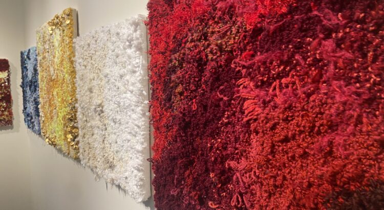
I moved on to Lopez’s punch-rugs. Each of these pieces follow a cohesive color scheme, and with the eye look a bit plainer than the multi-media sculptures since they don’t include as many mediums as the sculptures. (Don’t worry, though; there are still plenty of beads and buttons here).

Punch-rug pieces from Touch, by Ericka Lopez. Courtesy of Madison Hammond.

Despite being completely blind, Lopez uses color masterfully. According to Amanda Krugliak, the exhibit curator, Lopez has figured out how to distinguish different colored materials based on touch and scent. This unique method is part of what makes Lopez’s pieces so creative and imaginative; the exhibit is unlike any other that I’ve seen. It pushes the boundaries of the future of art.

I decided to try closing my eyes before touching each of these pieces– and this is how I suggest enjoying most of the exhibit, but these pieces especially. Lopez places different textiles in intentional patterns to create a landscape that comes alive as you feel it. 

In the center of the room, Lopez’s ceramic pieces sit atop two tables. The deeper meaning behind these pieces escaped me at first. I stared at the beautifully glazed coil pots before scanning the QR code to read about the pieces, where I learned that the warped and lopsided shapes come from Lopez hugging or holding the pots before firing. The relationship between the body and the art, the artist and her pieces, is what makes these pieces meaningful. 

Ceramics at Touch, by Ericka Lopez. Courtesy of Madison Hammond.

Accessibility within the arts can seem tricky. How can one convey a two-dimensional painting to someone who can’t see the painting? But exhibits like this, which also include exhibit descriptions in Braille next to the pieces, show that visual art can interact with more senses than just sight. For someone like myself, who is not visually impaired, the addition of the physical texture and sensory experience of touching the pieces made the exhibit feel so much more personal. Maybe more art should be made to be touched.

Touch is open 9-5, Monday through Friday, until December 13.

REVIEW: How to Build a Disaster Proof House

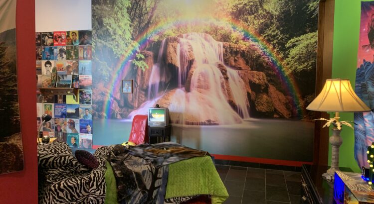
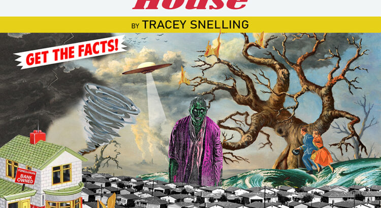
How to Build a Disaster Proof Home is the latest installation at the Institute for the Humanities on campus. Artist Tracey Snelling transforms the space into an explosion of color, sound, and texture as various home interiors occupy the room. Working both on a life-scale and a miniature scale, Snelling presents an exploration of what home really means and how one mentally and physically finds refuge in the contemporary world.

I’d like to examine this exhibit in a bit of a fractured way, pinpointing and elaborating upon various aspects as these come together to create the complete multisensory experience of Snelling’s work. Firstly–the aural. Before you even enter the space, you can hear a variety of monologues, sound effects, and music. This is because almost every section, or constructed home, has accompanying audio materials. Whether that’s a series of films being played all at once, or Duran Duran filling up a corner of the space, there’s a sense of the place being alive. The weaving together of sounds (the less delicate may call it a cacophony) create an entirely new sonic experience, one where the simulation of human presence is achieved. This simulation has both the comfort of a TV left on in the living room and eeriness of interacting with Siri or other faux-human presences. 

The same kind of aural complexity exists in the textures of the space. You find the tactile, familiar comfort of a worn rug juxtaposed with the tackiness, insincerity, and flatness of an idealized sunset-rainbow-beach wallpaper. There’s a dedication to different temporalities here, as a portrait in 70’s fashion hangs above a cherry red plush carpet circa the year 2000. The melange of these tributes to homes of past decades is fun and very carefully coordinated to maintain coherency, but there’s also a deeper, more touching and humanistic idea at the core of how we maintain familiarity and keep the things that we treasure most close to us (even if that’s the flimsy metaphor of hope behind a rainbow).


Finally, the color is alluring. Bright tones, eye-catching patterns, and iridescent touches are not only attractive, but add a very specific voice to the message of this exhibition. Ultimately, How to Build a Disaster Proof House is a sensory delight that makes you appreciate wherever you call home.

PREVIEW: How to Build a Disaster Proof House

The Institute for the Humanities’ latest exhibition will be on view this week, beginning March 16th. How to Build a Disaster Proof House consists of the work by the current Roman Witt Artist in Residence, Tracey Snelling. Snelling previously exhibited here and has come back again with sculptural conceptions of various worlds, looking to themes of escapism and environment while also integrating eye-grabbing pop aesthetics.


The show is free and certainly not one to miss, as there’s a slew of accompanying programming in conjunction with the works. It’s truly a community effort, as talks and workshops intersect with corresponding exhibitions and installations coming from institutions like the Ann Arbor Film Festival and the Ann Arbor Art Center.


The Institute for the Humanities is right across from the MLB, situated right in central campus– be sure to stop by!

REVIEW: Hometown Hero (Chink): An American Interior

As I stepped with socked feet onto the fabric-covered flooring of installation piece Hometown Hero (Chink), I was struck with an eerie and unshakable sense of familiarity. No, not from the hand-upholstered, Confederate flag recliner, or the country karaoke sounding from the plush TV – save for the artist’s face in the video recording, the 3-part installation itself was essentially free of any immediately recognizable, East-Asian motifs. So why did my experience feel closer to a revisit rather than a shocking introduction? I told myself that it must have been the culturally ingrained, practiced motion of taking one’s shoes off before entering a living space, or maybe the intimately homey experience of padding around a carpeted floor with the TV streaming white noise.  

The fact that the entire space is hand-sewn jumps out at me; under artist Valery Jung Estabrook’s skillful hands, everyday “soft” objects turn steely, while “hard” objects are revealed to have soft and sagging underbellies. The “lazy boy” recliner decorated with the image of a Confederate flag displays these juxtapositions most prominently; though the surface is composed of velvety chenille, soft-to-touch and associated with comfort, the repellent flag imagery strongly dissuades the viewer from touching the furniture.

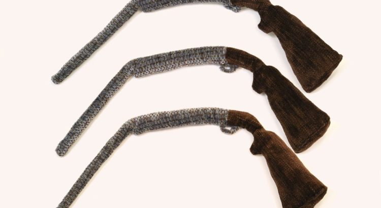
Even so, the recliner dominates the space, sending chilly tones throughout the warmly lit interior. Other striking plush components include the ‘pillow guns’, a set of three flaccid rifles mounted to the wall, and the ‘Born & Bred Beer’ beer cans casually littered on the recliner’s side-table. Chenille fabric, what the majority of the installation consists of, is immediately distinguishable through its tufted, caterpillar-like texture and iridescent appearance. These characteristics make the textile a popular choice for sofas, baby blankets, and other items that make direct contact with the skin. Needless to say, I was fascinated with the artist’s approach to materiality and her manipulation of sensory elements with chenille that served to contradict and even amplify the viewer’s psychological responses to derogatory imagery.
In a reflection about the title, Hometown Hero (Chink), Estabrook refers to the painful addition of the racial slur as a necessary component “… in order to have an honest discussion about the America that I know.” Her statement propelled me towards a question that I, and likely many others, have faced constantly while navigating ‘the Asian-American experience’: why the America that we know appears so dependent on the home that we say we know. I do not share Estabrook’s experience growing up in rural southwestern Virginia; what I do share are similar feelings of alienation upon being subjected to the white gaze – even at home, we are foreign spectacles singing along to the jaunty tunes of assimilation, while America reclines in a chenille chair, crushing ‘Born & Bred Beer’ beer cans in silent assent.


REVIEW: Paved with Good Intentions

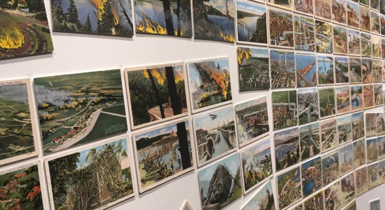
“The road to hell is paved with good intentions.” And from what it looks like, the foreseeable future that’s changing along with the climate is that hell. Artist David Opdyke’s exhibition changes the way you see the world and the bigger picture, both literally and figuratively.

His politically-charged art attempts to stir something in you, something nostalgic yet foreign. By creating a feeling of longing for the past and reaching for the future, he grounds you in the present. There is a sense of chaotic unity in the gridded mural landscape. It alleviates the gravity of climate change through its absurd humor while leading us through an anxious journey that some people wouldn’t be able to go through by themselves. The postcards create a personal relationship with the viewer, using scenes and landscapes we may recognize and defacing the postcards with his drawings in a fashion similar to how we deface the actual landscape.

“Paved with Good Intentions” utilizes different levels of intimacy. The installation works both from a distance and up close, and the intricacy of the details pulls you in, requiring you to step closer and look at every single postcard before stepping back out to see the whole picture. This work requires more time than you think it would take to look at everything, precisely because of how much there is to see. Every postcard is interconnected, from the tornado to the fire to the flying frogs, putting a global layer to something so local. The accompanying animation of his postcards uses a slapstick humor inspired from Monty Python’s “Flying Circus.” It uses a different media to convey the same message in a more animistic way.

The world is too big to quantify and the enormity of the climate change crisis is too large to fully encapsulate, but David Opdyke tackles it through something as simple and recognizable and approachable as postcards. Set aside some time to stop by the Institute for the Humanities to experience this humorously serious exhibition through February 26.

REVIEW: Deluge

At the Friday gallery opening for Gideon Mendel’s Deluge, I had grabbed a seat in front awaiting the artist’s talk when the artist himself appeared and encouraged us to first go and watch his 14 minute piece in full before returning for his talk.

A full fourteen minutes would usually test my patience for any single video piece- but the alien, overwhelming imagery coupled with constantly changing scenes spread out across five screens made the piece seem much shorter. When the piece looped back around to the beginning, I was sadly not yet ready for it to be over.  There were scenes that were very human and intimate, with figures forlornly staring into the camera in the flooded remains of their house. Other scenes looked like something straight out of a post-apocalyptic film, featuring boats gliding through sunken cities. Still others were more purely visual, focusing on the way that reflection and the waterline changed the landscape on both large and small levels.

The artist’s talk following our viewing of the piece itself was quite enlightening about both Gideon Mendel’s process and personal reflections on the work. We learned that the project was over a decade in the making, and had originally been meant to cover all environmentally caused natural disasters, but then narrowed in focus. He also reminisced that he encountered an overwhelming sense of dissatisfaction with the government and the status quo regardless of where he went, whether it be the most affluent or the poorest neighborhood imaginable. I was struck by the equalizing power of natural disasters, not caring about the color of your skin, or your background. Although, and Mendel made sure to note this, those previously mentioned factors made a world of difference when it came to an individual’s ability to recover from said disaster.

One of the things that I appreciated the most out of the entire event, was when the artist was prompted to answer where he felt his work best fit between the worlds of photojournalism, environmental activism, and fine art.  He instead insisted that his work not be pigeonholed into any one single realm, instead occupying a sort of middle ground. I could certainly see aspects of all three in his work, and agree that they were far more effective when used in harmony, rather than trying to merely fit only one category.

Another interesting element of this particular exposition was displayed in the utilization of the dual rooms.  The main gallery space was used to very effectively show the video, completely darkened with benches to allow viewers to sit and enjoy the entire 14 minutes of the piece.  The other room was used as a peek into Mendel’s behind the scenes process and organization of his material, with raw footage being played on projection and several wall installations on each of the walls.  Over the course of the two weeks that Mendel was to be staying at UM, he was challenged by the gallery curator to experiment in arranging, rearranging, and adding to the walls, so they might appear different in a week’s time than they were when I photographed them.  I was particularly inspired by the artfully arranged collection of photographs. The other wall was a play on the square format that is currently so ubiquitous due to influences such as Instagram.

Deluge will be displayed at the Institute for the Humanities Gallery right inside the entrance of the South Thayer Building until the end of the semester, December 18th.  The gallery is only open from 9am-5pm M-F, so be sure to stop by in between classes and experience Gideon Mendel’s provoking piece for yourself. Also if your interest was piqued by this piece, definitely check out Gideon Mendel’s website (http://gideonmendel.com/) or check out his instagram @gideonmendel .