
Did I say “next week” in my last column? Oops. I kinda forgot that Thanksgiving break was coming up, and then I ended up too busy with personal life stuff to actually make this post. Anyway, now I’m making this quick-ish overview of paper terms and types for making prints!
When making prints on paper of your artwork, something important to keep in mind is paper weight (which is almost always equivalent to thickness). Thicker paper is sturdier and harder to damage or bend, which both keeps your stock safer and also feels better for your customers compared to receiving a super thin paper print. Usually the way to evaluate printing company paper weight is through points, which is a whole number version of how many fractions of an inch thick the paper is. For example, 12pt cardstock is .012 inches thick. There’s also other ways of evaluating weight such as pounds or gsm (grams per square meter) that sometimes show up, but I’m less familiar with how those work.
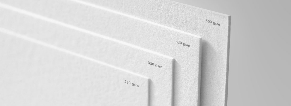
A sampling of papers with different gsm. Source: samedayrushprinting.com
There’s also a myriad of different paper types available for printing, but the ones used most often for poster prints are text and cardstock. Text paper is thinner paper similar to office printing paper or the pages of a book, while cardstock (also known as cover stock) is closer to the paper used for a greeting card or the cover of a softcover book. There’s also giclee, which is an archival-quality paper used for more expensive fine art prints that are meant to last, but I don’t use it since the per-unit cost is much higher than cardstock and my customer base prefers relatively affordable posters.
If you want personal recommendations, the paper I use from Catprint is specifically their Light Cardstock – Satin, which I feel has a good balance of sturdiness, light-weightness, and a finish that subtly enhances the artwork (I’m not sponsored, but I definitely wouldn’t turn down a sponsorship if I got an email about it). I’ve also tried 12pt gloss cardstock from Greko Printing (a Michigan-local printing shop) and found it similar in thickness and quality to Catprint’s Light Cardstock Satin, so that’s a valid alternative if you want to support local.
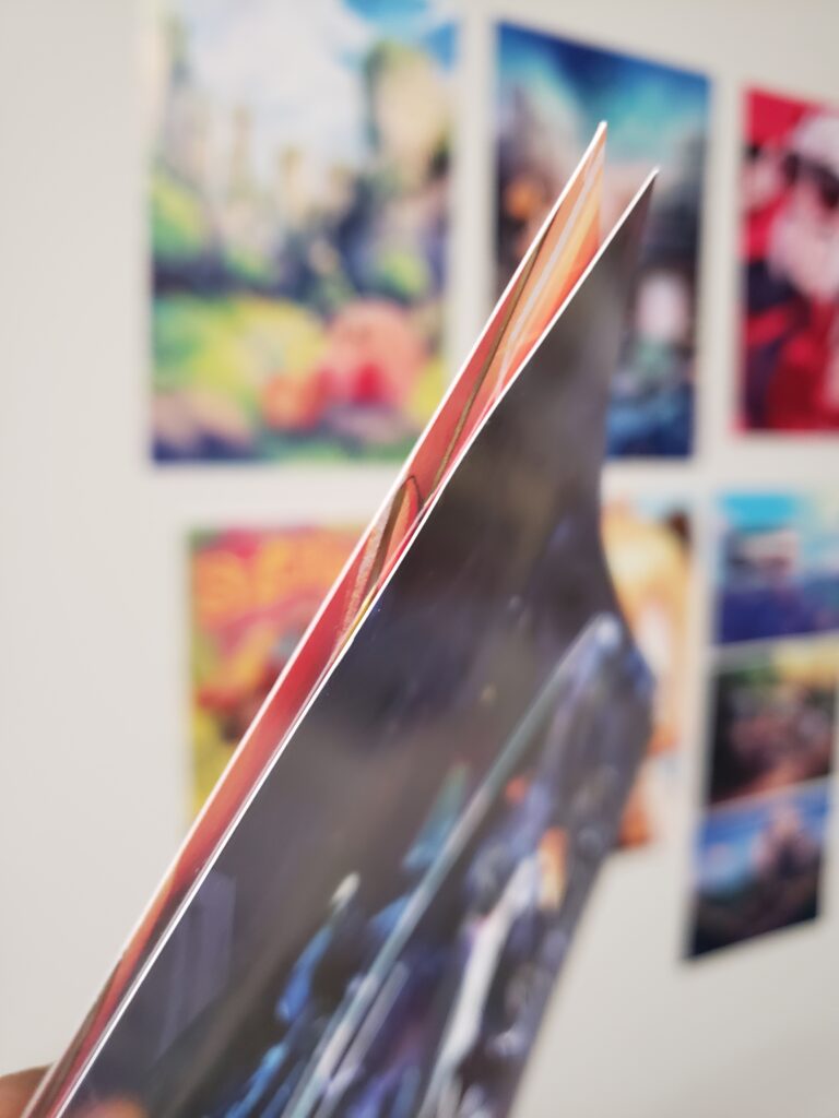
The print I made with Greko is on the left, while the print I made with Catprint is on the right. Greko’s feels slightly thicker, but otherwise the two prints are quite comparable.
If you print at home or (as a Stamps student) in the Digital Printing Lab using an Epson printer — which is a valid option if you prefer total control over your prints and can tolerate wrangling the printer yourself — Epson typically makes several types of papers that are good for art prints. I personally liked their matte premium presentation paper the most — their non-premium paper is way too thin and light for my liking, and I didn’t really like how the gloss finish on their gloss papers made my artwork look overly shiny. They’re typically available in packs of 25 or 50 online in various sizes (usually 8.5×11″ or 11×17″), and they even have some extra premium options like a canvas finish or extra thick paper that I’ve never tried but might elevate your prints.
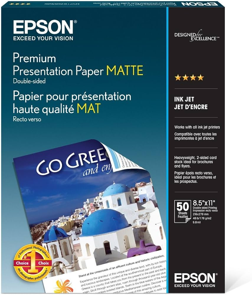
Don’t make my mistake — make sure that the paper you’re getting has the “Premium” at the top!
Honestly, the best advice I can give in the end is to order a sample pack (usually either free or at a small cost) from the printing company you’re interested in to actually see and feel for yourself which paper type would work best with your own artwork. Enjoy having your artwork physically sit in your hands as a custom print!
In terms of next week’s topic, maybe I’ll go back to showing and talking about my own artwork, since it’s been a few weeks of just talking about art business-related topics. Of course, I’d like to hear if you guys want me to cover anything specific in the future!


