Letters by Lydia: Summer Inspiration and Resources

Happy end of semester, everyone!  Congrats to all for making it through the year, and I hope you’re all settling into the summer.  This is my last post of the school year, so I thought I’d leave you all with some ways to stay involved in handlettering and art over the summer.

First off, here are some of my favorite lettering accounts on Instagram, if you’re looking for more inspiration, resources, tips, etc.

If you’re looking for something colorful, bold, digital, and maybe politically progressive, I’d recommend @inkusdingus or @glitterandbold.  For satisfying process videos and lots of juicy pens, I’d turn to @lettersandlattesllc (who also happens to be a fellow Michigander!), or @the_letter_salon.  For bullet journaling inspiration, definitely check out @thegraytergood, and for pen and stationery recs, look no further than @amandarachlee.  As for other favorites of mine, @snooze.one is a more experimental, graffiti-inspired typographer, and @keeplivingfaster is definitely the page to visit if you want watercolor lettering and lots of glitter.  Finally, if you want a page to get some general inspo and find lots of artists, my favorite account is @goodtype.  Enjoying your scrolling!

Now, if you want some website recommendations for some stationery shopping, here my go-to’s for that.

JetPens is a classic for keeping up with new pens as well as finding the classics, plus it has lots of variety and is reasonably priced.  Stationery Pal is really fun for specialty or limited edition items, cheap stationery (like, super cheap), and colorful and fun pens, trinkets, etc.  Shipping takes a bit, but in my opinion the price makes it worth it.  Tokyo Pen Shop is a new one I’ve been perusing, so I can’t speak to how it is to order from them, but they have a lot of fun and unique items.  For more stationery rather than pen-centered products, Present and Correct is a really fun one to check out for a very vintage, specialized feel.  And, of course, Amazon is always a fast and cheap option.  If you want to do some in-person shopping, Michael’s, Blick Art Materials, and even stores like Barnes and Nobles are all good options.  For Ann Arbor stores, I’d check out Rock Paper Scissors, Papersource, and Found.  There are tons of independent stationery stores everywhere, though, so if you’re traveling somewhere, it’s never a bad idea to look up stationery stores in that area (I’ve found some really good ones that way!).  Happy shopping!

I hope that information is helpful and gives you a lot to look into over the summer if you’re interested!  Either way, I hope you all have a relaxing few months and do some art if you can or want to 🙂

Letters by Lydia: Faux Calligraphy

Welcome back to another post! Today is all about faux calligraphy, so let’s start by explaining what that even is.

Faux calligraphy got its name by, as you might have guessed, being a sort of “fake” form of calligraphy.  Where traditional calligraphy uses a brush pen to get those thin upstrokes and thin downstrokes, faux calligraphy allows you to get the same technique with a regular old pen (or, really, any sort of pencil, marker, etc that creates a standard line).

In this example, the top version is regular calligraphy with a brush pen, while the bottom version is faux calligraphy using a marker with a bullet tip.

So how does this work? It’s actually pretty simple, which is why a lot of people, especially beginners, prefer it over traditional calligraphy.  A lot of beginners also use it as a gateway into traditional calligraphy, because it uses the same principles without requiring the technique involved in using a brush pen.

To start, you can just write whatever word/letter/phrase you have in mind.  This can be in cursive, or in print, whatever you prefer!  The next step is the key: you need to identify all the downstrokes. In the example below, I showed where the downstrokes are on the cursive letter “a”, but if you want a more comprehensive guide, I have a few other blog posts about handlettering basics that should help you out!  Once you identify where all the downstrokes are, you simply make those lines thicker, whether by drawing an outline and filling it in like I did, or by just adding a few extra lines around it.

Find the downstrokes, outline them, and fill them in 🙂
Here’s a little alphabet guide to help if you’re struggling with the downstrokes, too

Once you’ve got the basics down, this another style where there are a lot of fun variations to play around with. I included some of my favorites below, to show that you can do this with cursive or print, vary the thickness of the downstrokes, bring in color, etc. With the “lazy” and “hard” styles, the lazy one is just what you’ve been doing already (it isn’t lazy, it’s just easier than the hard version). The “hard” version is where you kind of map the downstrokes out in your mind ahead of time so that the lines don’t intersect and downstrokes remain solid white. This takes some practice to get the spacing right, which is why I called it the hard version, but it’s definitely not impossible and can be really fun to practice!

I hope you enjoy trying out a new style, or at least learning about it, and for all the umich students out there, have a great spring break!

Letters by Lydia: Ribbon Lettering

Welcome back to Letters by Lydia! This week I’m gonna give you all a rundown of something called ribbon lettering, which looks a little something like this (you might recognize that last picture from last week!):

In my opinion, the easiest way to do ribbon lettering is to use something most you probably already have: a highlighter. My personal favorites are the zebra mildliners, but any old highlighter with a chisel tip like this will do! When it comes to actually using this technique, the first thing you need to do is make sure you’re holding the highlighter the right way.  Instead of holding it like you would to highlight a something, where it draws a thick line horizontally, you want it to be the opposite way; once you’ve rotated your pen so you’re holding it correctly, it will draw a thin horizontal line and a thick vertical line.  Then you can start writing!  You want to keep your pen oriented that same way the whole time, because that’s what will give you this kind of 3D/layered ribbon effect. Another tip is to keep your strokes simple, especially when you’re first starting out. For example, instead of writing a lowercase “a” like you would in your normal handwriting, it might be easier to write it as a circle connected to a vertical line.

Satin Ribbons | Paper Source
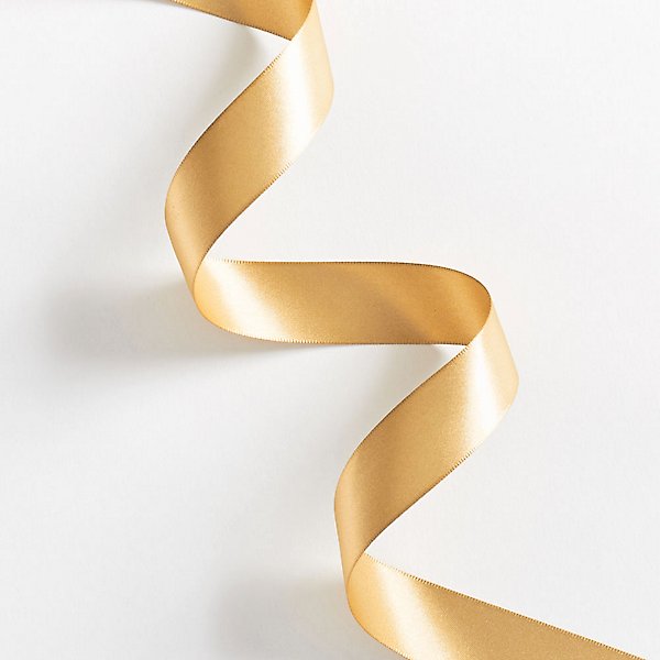
The next step is figuring out the “layers”, so to speak. For this part, it’s super helpful to think of what an actual ribbon would look like.  In this photo I got from the Papersource website, you get a really good sense of what I mean by the layers of the ribbon.When trying to figure this out with your own letters, you want to look for junctions where there’s some overlap, which I tried to illustrate in the diagrams below.  For ribbon lettering, there are a ton of options in terms of style, so you can either outline the sections of each letter, color in the “shadowy” parts, or do both!  I showed both examples so you can get a sense of how they each work.

Once you feel comfortable with that, you’re pretty much good to go! This is definitely one of those things that gets easier with practice. I love doing this kind of lettering because it’s very formulaic and reliable, so it’s nice to use for notes headings or things like that, as well as some mind-numbing doodling. That said, there are a lot of options to spice it up!  I illustrated a few below–as you can see, you can do this by just outlining the sections, or coloring in the shadowy parts, or both, like I mentioned before.  But you can also do this in cursive or in print, outline and color in the shadows with the same color, a different color from your base, or a different color entirely.  The options are really fun to play around with, so once you get the basics of it, enjoy playing around with all the different options!

Hopefully this was educational and made at least some sense! Please feel free to leave any other questions you have, and have a lovely week!


Letters by Lydia: Valentine’s Day <3

Hey y’all! Since Valentine’s Day is coming up, I thought it’d be fun to give some ideas for anyone looking to make valentines for their loved ones.  I know a lot of people don’t like Valentine’s day because it can be really tough when you’re single, but I’ve always loved it because I have so much fun making cute little valentine’s for all my friends!  It’s like a crafter’s dream holiday, getting to sit down with washi tape, fun paper, stickers, pens, and make cards for the people you love.

Anyway, here are some different styles for lettering I thought fit the Valentine’s aesthetic:

A fun ribbon font always looks good, and you can’t go wrong with doing conversation hearts! For the last one, I just thought it’d be cute to do something a little more structured but still fun and with lots of red and pink.  I’m always happy to do tutorials on different types of lettering like this too, if anyone is ever interested 🙂

As for general guidelines for making Valentine’s cards, I honestly feel like you can never overdo it.  I love to go all out with glitter, lace, bright colors, stickers, etc.  Even if you don’t want to go that route, basics like pastels, hearts, red and pink, and all that cute stuff never fails.  I also love doing puns (Love you a waffle lot, olive you, etc etc), cute little drawings, and inside jokes because that makes the cards more personal and heartfelt.  As for little drawings and extra things to add, you can always do candy, hearts, bows, flowers, roses, and literally anything you think the recipient would like 🙂 Here’s a few little doodles I came up with:

I hope this made you excited to make some cards for your loved ones if you’re so inclined! Either way, have a great week and enjoy your Valentine’s Day next week! <3

Letters by Lydia: Sometimes it Doesn’t Work

Welcome back to Letters by Lydia! Hopefully everyone was able to stay safe and warm in the snow, or maybe even go out and build a snowman 🙂

Today I want to talk about all the times–and trust me, there are many–that lettering ideas and techniques don’t work out.  A lot of times in the art community, especially on social media, we only see the work that people are super proud of: work that’s polished, high quality, creative, unique, and so on. Because of this, it can be really easy to fall into the trap of feeling like your work isn’t good enough, or that everyone else is much more talented. That said, I have noticed lately that people on social media seem to be getting a little more vocal about the importance of the process. Bad art is just as important as good art, because it helps you learn and grow as an artist. If your art was perfect all the time, there would be no room for experimentation, doodling, mistakes, and most importantly, fun!

I’m sure none of this is news to most of you, but I wanted to share an example of some lettering I did today that I couldn’t quite figure out. I wanted to try a new lettering style where it looks like letters someone wrote with their finger in the snow, which ended up being much harder than I anticipated.

After consulting an overwhelming number of google images, my first attempt landed me with this:

When I first did this, I wasn’t in love with, but with some distance I can honestly say this might’ve been my best attempt.  I chalk it up to beginner’s luck, though, because I could not for the life of me produce this kind of style again.  In hindsight, I think the key was only using two colors, because this was the only attempt where I limited my color palette that much.

My next attempt I’m actually super proud of and think looks pretty realistic. The issue? It took forever, so it didn’t feel reasonable to try and do a whole word in this style. My original idea was also to have this as a type of style, not a kind of one-time piece that would be difficult to recreate.  In any case, this is what I ended up with here:

After this, I started trying whole words, and played around with using the colors in different ways, different textures, and different thicknesses.  I don’t dislike any of these, but I don’t think any of them read quite as I wanted them to–they look like pretty snow-themed pieces, but not necessarily like someone was writing in the snow, unless you’re looking at them with that style in mind.

Of course, in this example of things not working out, I still generally liked the end results, they just weren’t what I had in mind originally.  That said, I can’t tell you the number of times I try things that end up looking absolutely terrible, and I can definitely start sharing that stuff too! But I thought it was important to show that there’s also this middle ground where the work you produce is still good, it just doesn’t align with the vision you had, because this also allows for artistic experimentation and learning new styles and techniques.

This is a style I plan to experiment with a bit more and see if it’s something I can refine, but even if it isn’t, I had fun playing around with something new!

I hope you enjoyed reading, and stay safe out there in the snow!

Letters by Lydia: Cursive vs Calligraphy vs …?

Happy Wednesday, y’all!

Today we’re gonna take a bit of a deep dive into the terminology for different types of lettering.  Overall, it really doesn’t matter, but I would say the most common question when it comes to lettering is “isn’t it just cursive?”  If you don’t know the difference either, no worries!  Hopefully this clears things up 🙂

So what’s cursive? I’m sure most of you are aware of what cursive actually is, but things probably get a little foggy in terms of how it differs from other forms of lettering. The main difference is that cursive isn’t really a form of art and instead a style of writing. Cursive is supposed to be a way of writing that’s more efficient than regular writing because your pen never has to leave the page–in other words, it’s practical and more of a fancy-looking shortcut than anything.  It’s also much more rigid in terms of style and rules; there’s a cursive alphabet that, aside from a few stylistic variations, is pretty set in stone.

Lettering (synonymous with handlettering), on the other hand, is an umbrella term for all sorts of word art. Calligraphy, which falls under the lettering category, is probably the most similar to cursive.  There’s a lot of different kinds of calligraphy, but it’s typically based loosely on cursive, and is centered on the idea of using strokes (you can check out my post on upstrokes and downstrokes to learn more about that!).  Unlike cursive, calligraphy is much more flexible and can involve a lot of experimentation or style variation, which in my opinion makes it a lot more fun.  You can see my version of a calligraphy alphabet below, and then I also included potential variations of uppercase letters (A) and lowercase letters (I chose “r” because it has a lot of fun options).  Some people also refer to this as modern calligraphy, because calligraphy can also refer to the sort of gothic style that would use a pen and ink or some sort of pen with a nib.

Lettering in general essentially just means “drawing letters” in an artistic way.  This means that instead of adhering to strict rules like cursive, or requiring the use of strokes like calligraphy, lettering can be any creative depiction of letters.  For example, bubble letters would fall under the lettering category, because instead of using lines and strokes to create a letter, you’re using shapes.

There are pretty much limitless other categories that fall under the umbrella of lettering, but some other common ones include brushlettering, which I’ve talked a lot about, faux calligraphy, serif and sans serif, gothic, and tons of other ones.  Hopefully that helps clear up any confusion, but feel free to leave any other questions in the comments!

Have a lovely rest of the week everyone 🙂