Industrious Illustrating #55 – Study Step-by-step

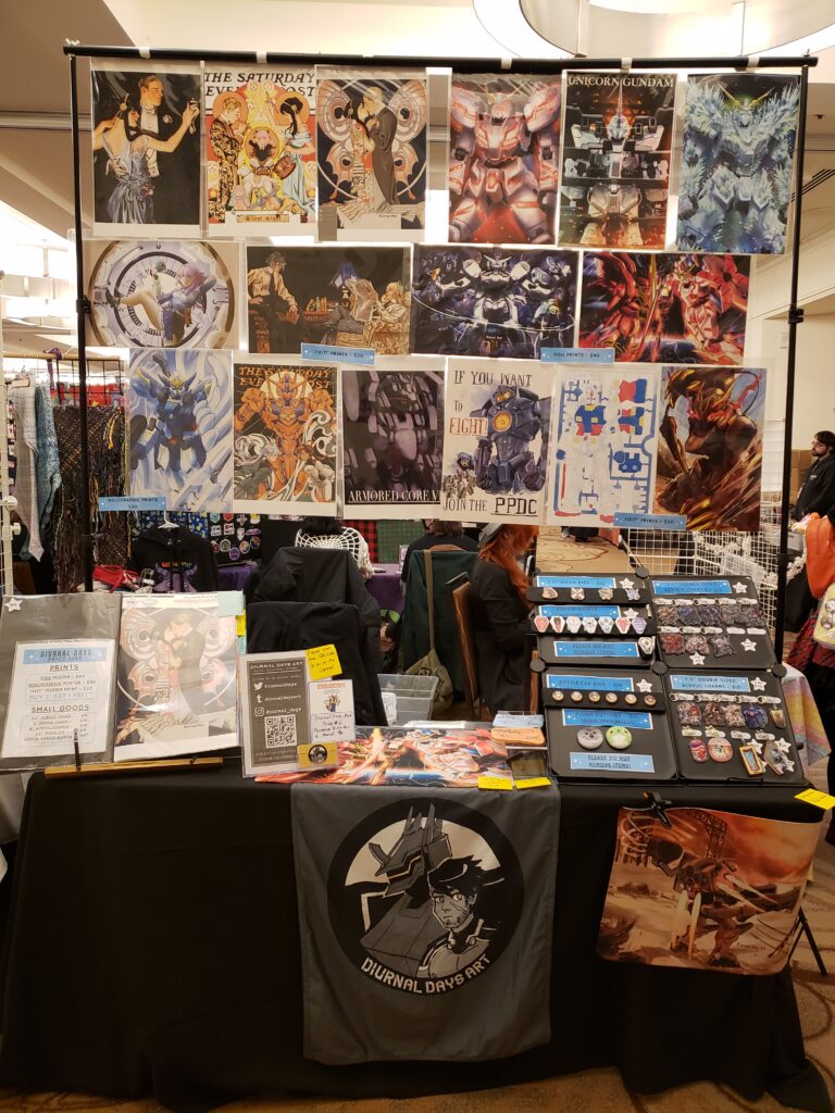
Hello and welcome back to another week of Industrious Illustrating! This week I’m doing a quick breakdown of how I do digital painting studies to brush up on my fundamentals and improve my mental visual library for my drawing and design work.
It’s generally better to do studies from life rather than from photographs because cameras distort reality and also you can understand the subject from more angles if you see it in real life. However, for this exercise I’m using a Shutterstock stock photograph because trying to find and draw an excavator on-site during the winter months is too much hassle for me personally.

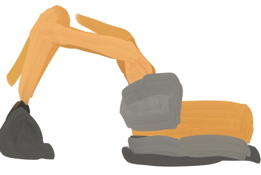
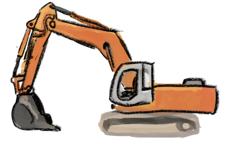
My first step is to draw color blocks to get down the idea of the subject matter while not worrying too much about complete accuracy. It’s way easier to work with a drawing that already exists than with a blank canvas.

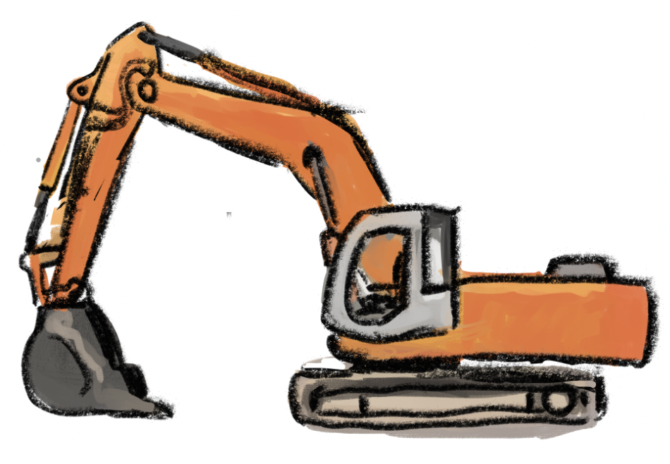
My next step is to tweak the proportions and start adding in details to represent what I see in front of me.

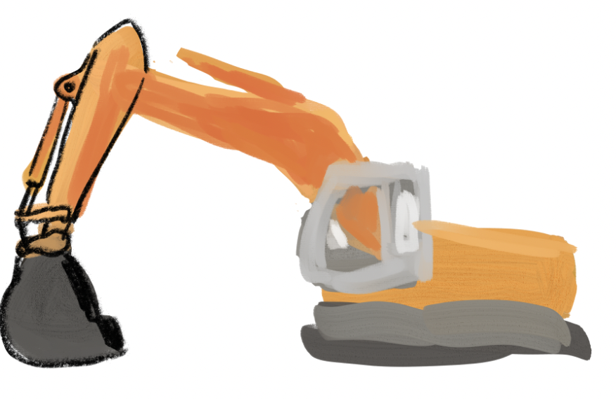
As I work on details, I realize that some of the proportions aren’t correct and fix them. This is also how I work on my regular art pieces — mistakes are just a natural part of the process and can be overcome!

The finished study now looks like this! It’s not a fully refined drawing, but I feel like I’ve done enough work to better understand how the different parts of an excavator work together, which was the goal of my study session anyway.

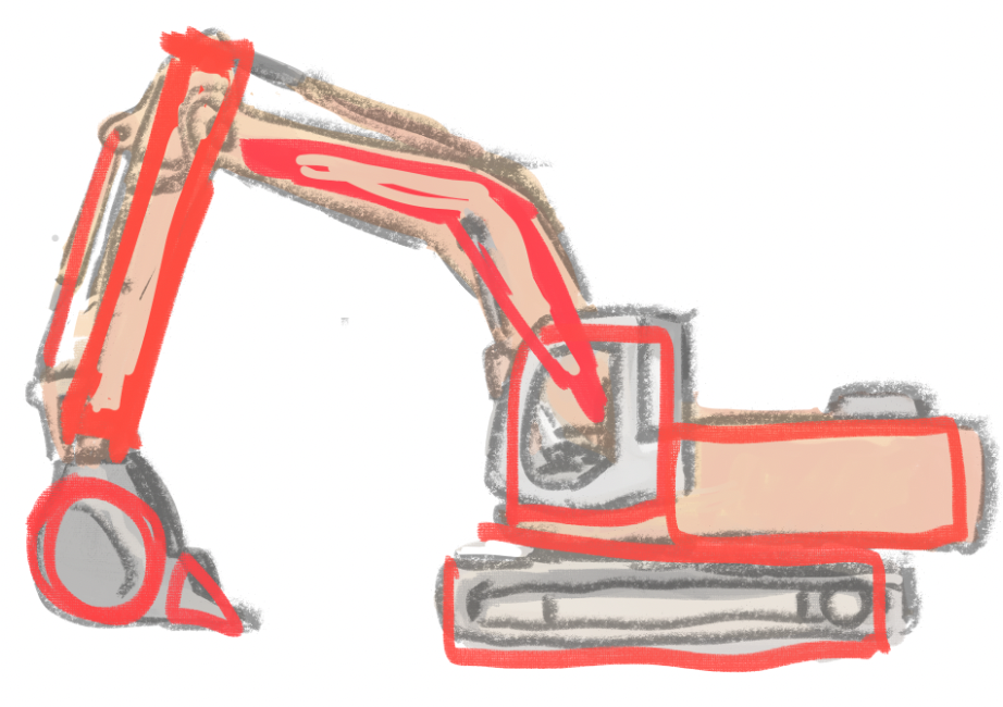
I even draw shapes over my study to solidify my understanding of what the basic building block shapes in an excavator are.

Of course, this is only one way to do studies, and there may be a way to learn that makes more sense to you! I just hope that talking through my process like this helps you discover what might work best for you in the future. See you next week!

Industrious Illustrating #54 – Progress Pictures

This week’s column is a day late because I’ve been tabling at Isshocon, a new 3-day anime convention located near us in Novi Michigan! So far it’s been going fairly well considering that it only has fewer than two thousand attendees — I’ve made more money than at Motor City Comic Con Fall for a much less expensive table, though my work is much better geared to anime conventions. Here’s a picture of my table:

The main topic of this week’s column is going over some work-in-progress pictures from my recent drawings, which has been on my mind because the application for Fanime Con (a large anime convention that happens in San Jose, CA on Memorial Day weekend) required a signed work-in-progress picture to weed out AI “artists” and art thieves. I’m in a group chat with a bunch of other artists who sell at conventions and seeing everyone else’s progress pictures was really interesting for seeing how other artists work. I won’t use the work-in-progress images I used for my Fanime application to keep it private, so I’ll instead go over a chibi mecha design I drew last year with WIP screenshots I took during the process.

My typical digital working process starts with “blocking” out the drawing as a color sketch, working more on getting the general idea down rather than having perfect proportions or coloring.

As I work on this base colors sketch, I freely use the lasso tool and eraser to resize and edit parts I don’t like in addition to working more with the default oil paint brush tool I use for my work.

Once I have a baseline I’m happy with, I start doing lineart from the top to the bottom on another layer, working more on the rendering and polish as the lineart solidifies what I want the drawing to look like.

Compare with my finished drawing:

Would you guys like to see me do more breakdowns/work-in-progress sequences of my drawings in the future? I’d love to know if you do!

Industrious Illustrating #42 – Summer of Artwork

Hello,

Sorry about the late post! I had a bunch of deadlines and personal matters come up toward the end of the week, so This week, before I make posts about broad topics, I want to share some of the artwork I made over the summer that I liked the most.

I recently designed this shaker charm themed around Devil’s Hole pupfish, which are a critically endangered species of fish native only to a specific pool of water in Death Valley! Shaker charms are basically acrylic charms with a hollow interior compartment that has individual acrylic pieces which can be shaken around, as I demonstrate in the below video:

In other fun animal-themed merchandise, I also designed a fat squirrel wood pin as a fun and eco-friendly alternative to enamel pins. It’s a loving reference to the chonky squirrels that populate the Diag, though they also have general appeal for anyone who enjoys round orb-shaped cute animals.

I also made myself a logo to use on my branding online and at conventions featuring my original character Toshiaki and his mech “Bhairava”. It’s simple but also still drawn in my style to reflect my unique artistic style. You can also see it in the top right corner of the 2023-2024 Industrious Illustrating banner!

In terms of my digital painting skills, I spent a bunch of time working on improving my painting skills with bigger and more complex drawings than before! I translated one of my mecha digital paintings into a physical iridescent foil print which makes their lights change in color from different angles, defying the usual static rigidity of a paper print.

I also experimented with more complex perspective and color schemes I don’t usually use in my artwork:

All in all, I feel like I had a pretty fruitful summer of experimentation and improvement! I also tabled at a handful of smaller one-day events where I brought in alright sums of money to tide me over before I do a few three-day events in the winter, which I’ll talk about in another post! Anyway, see you guys again next week!

Industrious Illustrating #21 – Two-Tailed

Hello again, and welcome back! When I was abroad vacationing in Spain and Portugal over Thanksgiving break, I saw a lot of interesting art and architecture, but one particular image I saw depicted on tiles particularly stood out to me (warning for some partial nudity): 

After seeing the twin-tailed mermaid, I immediately had the idea of making a drawing where her tails more closely resemble legs. This is what came out of it:

I’m swamped with final projects and assignments at the moment, so I didn’t have the time to push this further than a black-and-white sketch, but I hope to develop this piece and this concept further in the future to make something interesting out of it. Good luck with the last few weeks of this semester, everyone, and see you again next week!

Industrious Illustrating #18 – Ten Thousand Buddhas

Hello again to another week of Industrious Illustrating!

Last week I tabled at Youmacon with my tablemate Ria, another STAMPS student. My half of the booth was on the left, while hers was on the right. I blocked out everyone’s faces in the below picture to preserve their privacy.

By the end of the weekend, both of us had recouped all of our production costs as well as the cost of the table spot, and we’d made several hundred dollars in profit on top of that. Our total revenue was somewhere in the low four figures range split between the two of us. While we don’t plan on splitting a table again because we could both use the full 8′ table for our displays, we’re both hoping to apply to Youmacon again and table next year if possible!

Anyway, while I’m currently trying to keep up with a deluge of work and deadlines before Thanksgiving Break, I took some time last night to make a quick painted study of a photograph I took at the Ten Thousand Buddhas Monastery in Hong Kong this past summer. I focused on describing the value relationships and lighting as quickly and efficiently as possible rather than letting myself get mired in the details. Hopefully I can find more time to make these studies so that I can brush up on my painting skills and build up a better visual library in my head.

Good luck to everyone working on exams and projects close to the end of the semester, and see you again next week!

Industrious Illustrating #12: A New Semester

A new season means a new semester, and a new semester means a new Industrious Illustrating banner! It’s been a while since I last posted to this blog, and I hope that the summer was a restful or productive time for all of you, whichever one was your goal. While I have some exciting new projects I want to share with you guys over the next few weeks, I want to focus first on a brief recap of a few pieces I made over the summer.

For most of the summer, I was spending time living with my parents in Hong Kong. We lived pretty close to the beach, so sometimes I’d go down to the beach and look for interesting-looking animals in the sand and rocks. Attached are a few watercolor and ink sketches I made of a Fiddler crab, as well as some clams, sea urchins, and sea snails I found when the tide was low.

Aside from sketching the wildlife, I also made more refined illustrations based off of the scenery and sights I saw in Hong Kong, albeit with a few changes for artistic effect. For example, one of the new pieces on my year 2 banner features a tiger girl dressed in summery clothing while leaning over the railing of a staircase next to overgrown terraces. This is actually based off of a real staircase near my summer home that led down to some tropical fruit trees and a tiny beach (though it wasn’t the one I frequented).


If you look at the other side of the new banner, one of the pieces I added features a girl floating in a brightly lit vestibule as if she’s in a spaceship. This is actually inspired by the Moncler clothing store display in Hong Kong’s International Commerce Center, which always caught my eye when I was walking from the Kowloon MTR stop through the ELEMENTS shopping mall and the ICC lobby. I made a few tweaks to the lighting to make it look more dramatic, but otherwise I kept it close to the reference in an attempt to capture what I liked about the design.

For a side by side comparison:


Unfortunately, I haven’t gotten around to making more studies of the sights I saw in Hong Kong, or even more pieces inspired by what I saw in Hong Kong, but I’ll be sure to work on some and post them when I have time!

What did you guys do over the summer? I would love to hear about it in the comments.