
If you’ve read last week’s post you now know my take on B&W photography and how in my opinion a lot of times it is used to cover up mistakes made in the original photograph before the edit. I argued that the best B&W photos are the ones that are intended to be B&W photos from the start, yet, I think you can absolutely discover that your photo is “eligible” for B&W photography in the editing phase. I’d strongly encourage you to try it, just for the sake of it, but while doing so keep in mind that it is supposed to add something to the photo, not rescue it. That’s why in this post I will try to explain some things to avoid if you try B&W filters.
Now, I chose photos that in my opinion do better in color but could look good in B&W too.
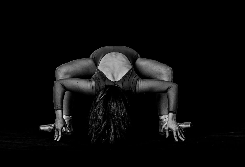
The first photo is one of my worst nightmares and it’s using way too much contrast, detail, and texture. It just looks burnt for some reason. People do that kind of editing often in color too, but I think it’s easier to commit this crime when shooting in B&W. Just please don’t.
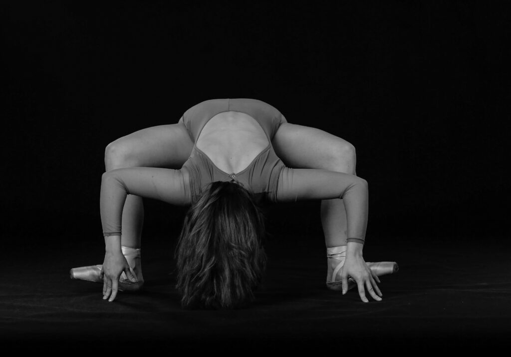
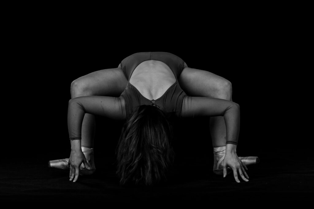
The second image is way too faded on the other hand. I believe for this I used a Lightroom present (these can be helpful sometimes but 1. not every preset fits every photo and 2. not all of them are good). It is supposed to look misty but instead, you have a complete loss of texture. It’s not as bad as the first one but it definitely flattens the image. The third photo (while not ideal), balances the contrast with texture and brings out the figure out of the black background without making it feel like it’s cut out.
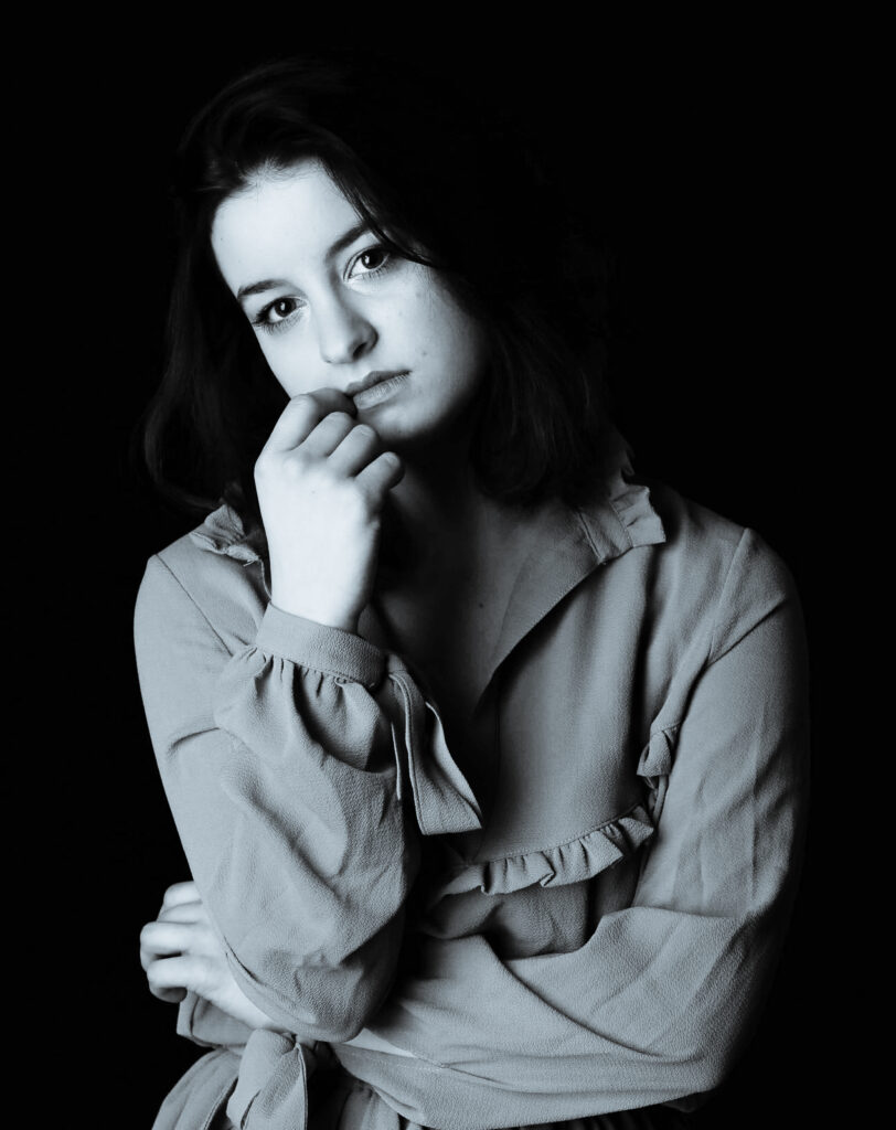
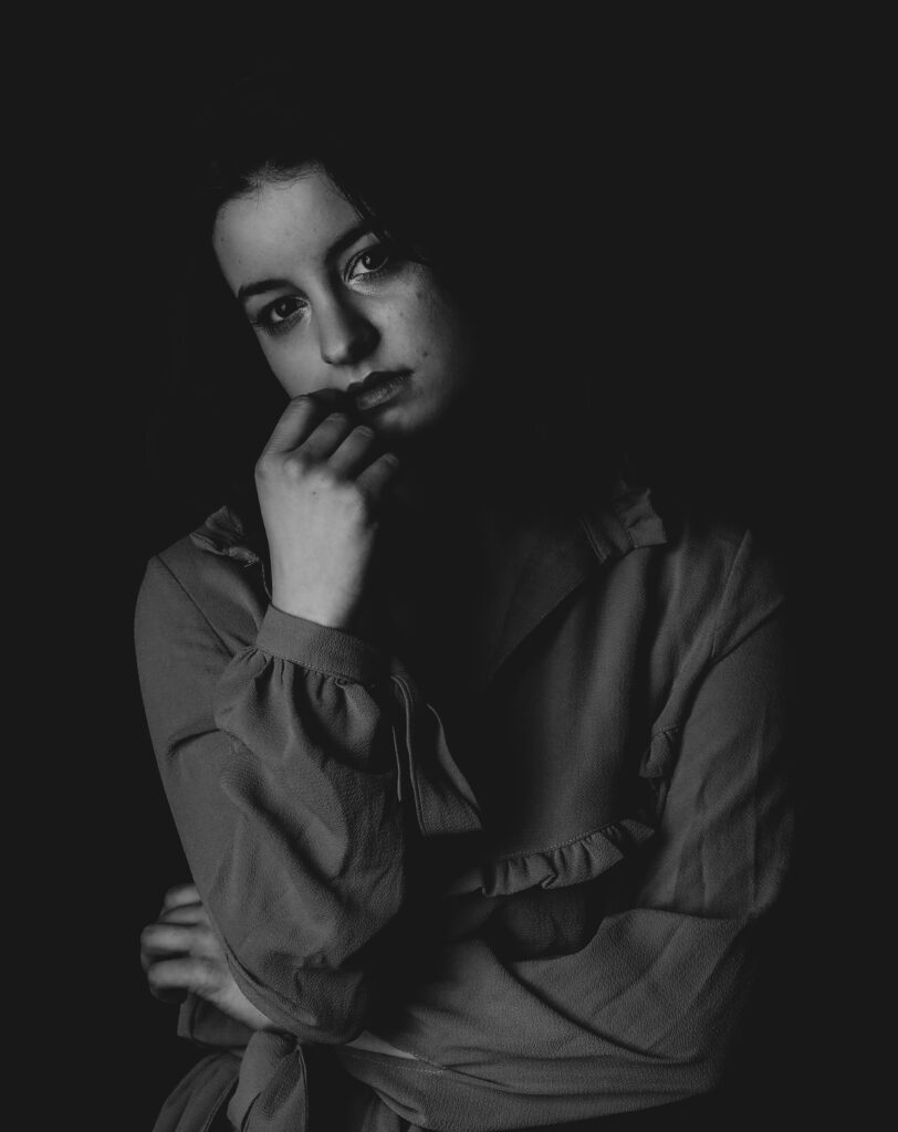
Many times we decide to edit in B&W it’s actually when working on portraits so we can add some “mystery” to it. Well, the first one makes the figure look like a ghost. It’s simply way too enhanced on highlights with cold tones. My mom who actually used to be a photographer (hi mom) always says that for some reason photos like this make her think of obituaries. Please don’t overexpose and don’t cool down the image too much.
The second image is a very very popular edit people use in social media. It’s a faded preset that flattens the image while also lightening the shadows and increasing the brightness (not necessarily exposure) of the picture. Is it terrible? No, it can be cute sometimes. Is it professional? Absolutely not.
In the last picture, again, you see there is a balance between the shadows and whites. You want the person to be coming out of the background but not blend with it. I actually increased the texture here by a few points to make that distinction, increased contrast, turned down highlights, and increased shadows by a tiny tiny bit.
Let me know if you like this new format of posts so I can think of more opinion pieces/tutorials. See you next week!
-Tola

Leave a Reply
Be the First to Comment!