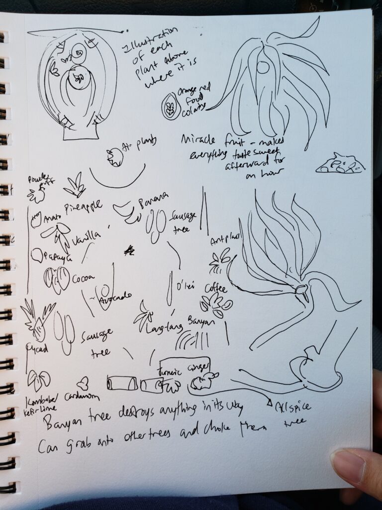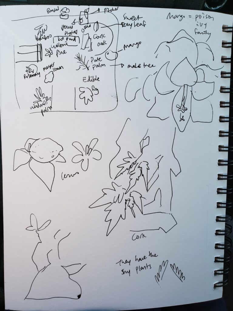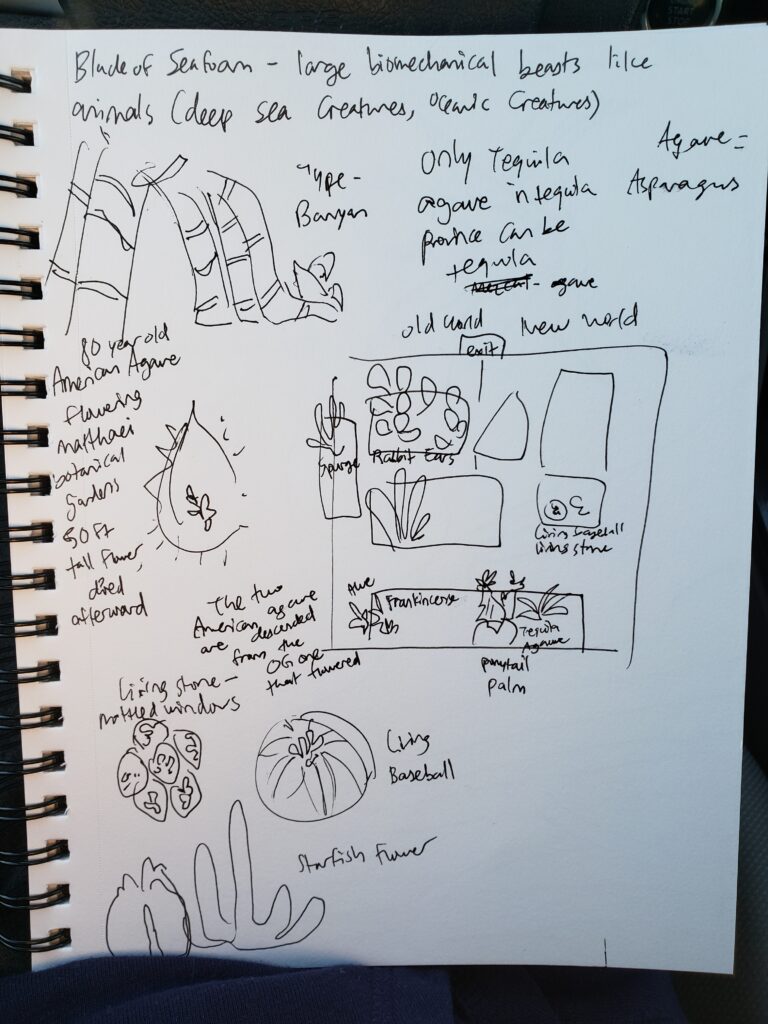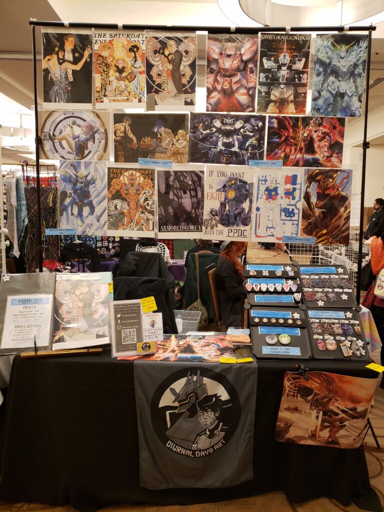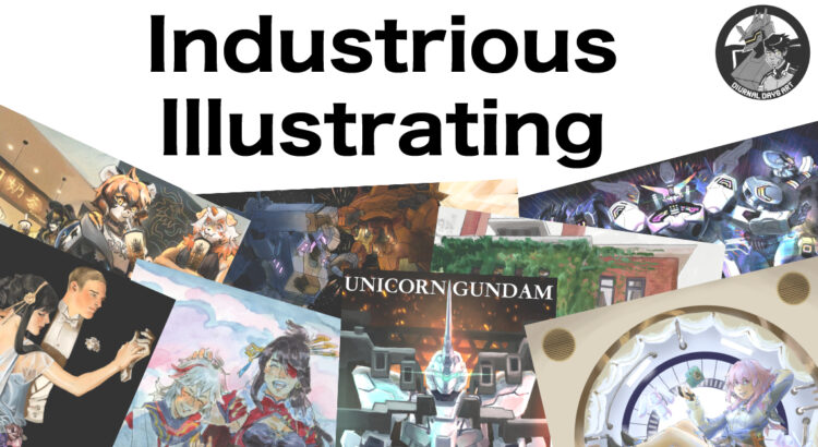
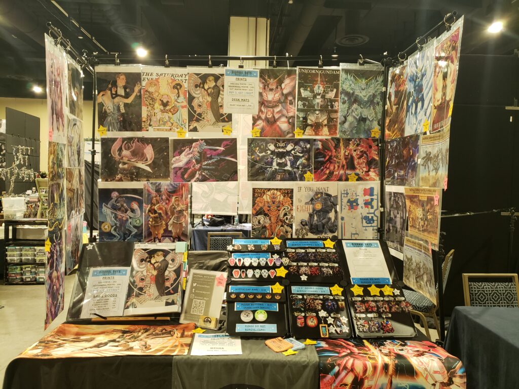
Hello, and welcome back to another week of Industrious Illustrating! This week’s post is late because I spent the entire weekend in National Harbor, Maryland (near Washington D.C.) at Katsucon — a large anime convention — in the Artist Alley selling merchandise of my artwork! It broke my previous convention sales records several times over and I ran out of a bunch of merch designs, so I’m very happy with the results! I also got to network with and meet a bunch of other amazing artists!
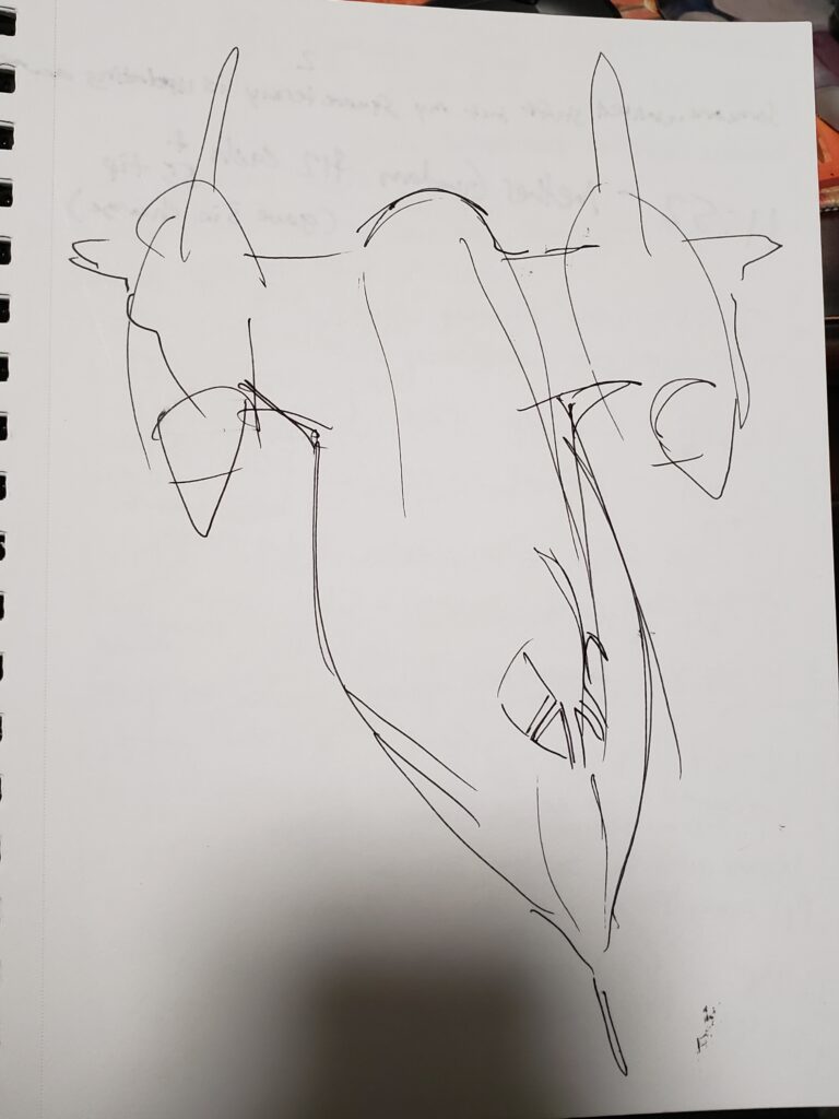
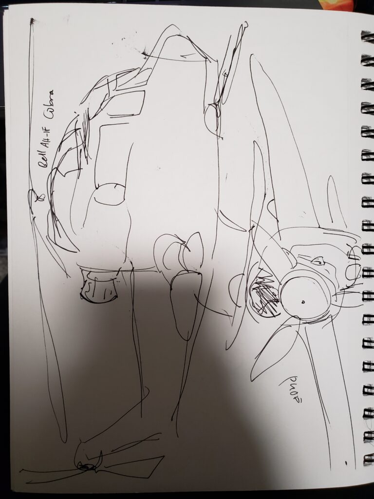
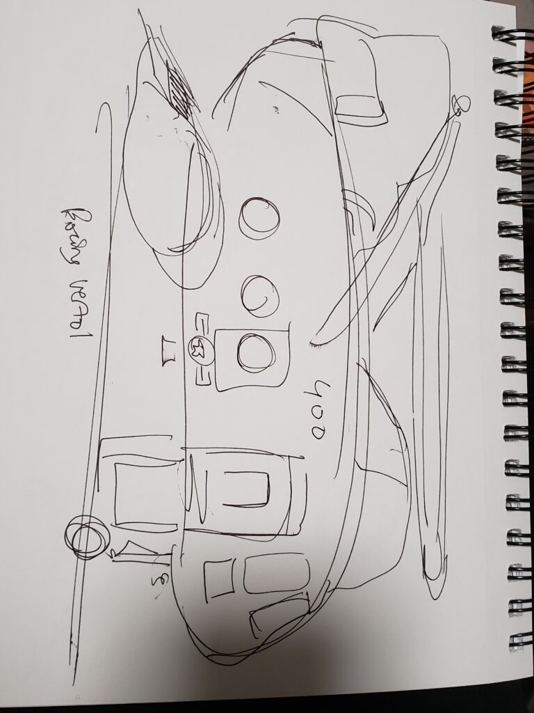
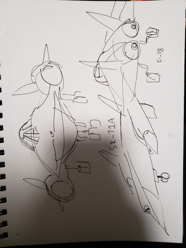
When I was in the area, I also visited the Steven P. Udzar-Hazy Center, which is an offshoot of the Smithsonian Air & Space Museum located nearby in Virginia where the space shuttle Discovery is on display alongside an SR-71 Blackbird, a Concorde supersonic plane, an X-35B STOVL, and many other exciting civilian and military aircraft! I took lots of reference pictures and even did some on-site sketching to the best of my abilities, though I’m not as practiced at drawing aircraft and I was exhausted from driving all the way to D.C. (with an overnight stop at Pittsburgh) last week.
Anyway, I’m elated that I got the opportunity to do a convention outside of the Michigan-Ohio area for the first time and that I gained so many valuable experiences from it, plus I had lots of fun and made enough money to fund my next art business ventures and pay for a bunch of personal expenses! I’m looking forward to my slate of upcoming cons next month (Anime Milwaukee in, well, Milwaukee at the beginning of the month, Sakuracon in Seattle at the end) and I also hope to do more original design work soon with aircraft as inspiration!