Student at the University of Michigan studying Art & Design and Communication & Media, hoping to create meaningful design for social impact. Every week I highlight an intriguing artist (or group of artists)!
Like many other artists I’ve grown to admire, I discovered Miles Tewson on Instagram. A UK-based illustrator, Tewson creates gorgeous illustrations of desertscapes, sunrises, and waves. If you’re a fan of colorful ~minimalist~ art, this is the artist for you.
Miles Tewson’s art boasts tranquil nature scenes and small moments in ordinary life with limited of color palettes often constructed of oranges, blues, and greens. While the compositions are simple themselves, they boast the talent of an experienced illustrator and printmaker. His adept hand so beautifully captures the mundane in a way that makes you stop in your tracks (or your scrolling) for a second and let yourself appreciate the view. Calming scenes of a winter walk or light streaming through a window are common, but richly colorful and inviting.
What really wows me about Tewson’s art is his strong individual voice, which is featured throughout every piece he makes. His creative vision of clear and is carefully crafted. It’s just the right amount of skill and whimsy for me. Be sure to take a peek at his Instagram account to get an insider’s view of his unique creative processes, which include both digital art and acrylic painting.
He also sells prints, apparel, and jewelry on his website–but beware, they sell out fast. Perhaps I’ll ask if I can use one of his illustrations for my next tattoo…
This week, I (virtually) sat down with Stamps BFA senior Claire Smith. As a fellow fan of branding and Aaron Draplin, I asked Claire about her inspirations and motivations.
Q: So I really like your graphic design work. First, can you tell me about what inspires you to make work?
Claire: Ooh, that’s a tough question. A lot of times it’s like things that other people need.I think that’s where I find the most satisfaction in my work is when I’m making things actually for other people. I’m a fairly practical person, so it’s helpful to know that it’s actually like being useful in the world. I also enjoy helping other people reach their goals, so I guess that’s a main reason behind why I make things.
In terms of how I find inspiration for different styles, I just always look at other artists and see what they’re doing. I have a Pinterest board full of different inspiration styles that I really like, I like talking to like other students and other graphic designers that I know to see what they’re up to.
Q: That’s great. Do you have any specific designers or artists that you look up to?
Claire: Yeah, well my all-time favorite graphic designer is Aaron Draplin, you know, classic. I just enjoy how he doesn’t take design too seriously. A lot of times when I look at my Dribbble or something, like people are really like, everything needs to be perfect and super classy or whatever. And [Aaron] just is very unapologetic about just throwing colors and shapes together and just like having fun with it. And I love Field Notes.
Also, one of my favorite artists is Sam Larson. He’s more of an Instagram artist I would say. But he does a lot of American Southwest inspired art, like lots of animals and plants and things like that. But I like the way he experiments with a lot of different styles. He has like a very set way of doing things, but he is also constantly experimenting. I like the way that he isn’t afraid to try things, even if people don’t end up liking it.
Q: So going off of your interest in graphic design and making things that help other people, do you know what career path you want to go on?
Claire: I would love to go into branding and visual identity design–I think just that’s the most fun, because I think you can be the most creative with it, like starting from scratch and making something new. Then it can help someone who’s like trying to start a business. Honestly I just love design so much. I’d be happy doing anything that just involves design, whether that’s in house somewhere or not.
I interned with Michigan Athletics last year and I haven’t ever done athletics or sports-related design at all, but that was honestly really fun. I also did that Stamps alumni mixer. One of the people I talked to, she works for the LA Dodgers now and I was like, “Oh wait, that’s kind of cool!” I always figured that that’s a possibility. So I want to say it would be fun to work in the sports industry, but I think mainly branding and visual identity. I think the goal is to eventually be able to freelance, but that might be a while.
Q: Nice. Do you know where you want to be?
Claire: I’ve been thinking a lot more about Detroit lately for a few reasons, cause it’s closer to home. Then also I’ve been working this semester with the Detroit Neighborhood Entrepreneurs Project and doing some design work for them. I really enjoyed learning a lot about small businesses in Detroit and how there’s whole neighborhoods, of entrepreneurs and that’s a huge area of growth. It would be fun to continue trying to help them out. There’s also one of my favorite design studios called Skidmore Studio and they’re in Detroit, and it would be really cool to end up working for them.
But I think ideally if I could go anywhere, I really love the West Coast. So Oregon or Seattle, or Colorado, but probably Oregon.
Q: Can you talk about your favorite project or the most challenging project you’ve done?
Claire: One of my favorites is the one that I did while studying abroad. It was pretty fun obviously, cause I was in Denmark–the Copenhagen Jazz Festival project. You did everything yourself. You researched the festival and then we did a ton of ideating projects, like random drawing whatever comes to mind when you listen to music. And then it was kind of interesting to see how concrete ideas could come out of that, even when it felt sort of random. And then it was branding, so I really liked making a logo and then a whole identity and an entire project. That was a lot of fun.
I think the most challenging one, at least the one on my website right now, is Molar Bear, that was tough. ‘m not very experienced with UI UX design. So that was a whole new thing to try to learn Figma, but it was really fun. There was so much research that went into it. I think with both of those projects, I learned a lot about research being important, because I think sometimes I get impatient and want to just jump into the designing, but it’s all about research.
Q: I feel the same way. So in your studies at Michigan so far is there a favorite class that you’ve taken?
Claire: I took Typography with Beth Hay and that was really good. I think something about Stamps is I feel like they always tell us to do these projects but don’t teach us actual, foundational design techniques, like “here’s how you lay things out.” So I feel like in that class, I actually did learn about the grid and learn about hierarchy and stuff like that. I definitely still use skills that I learned from that class. And I really liked the final project.
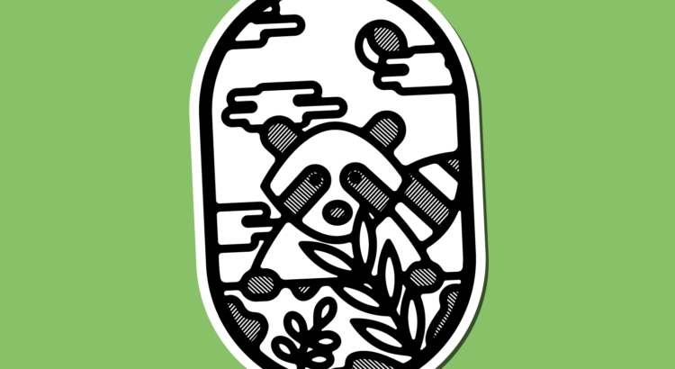
Q: I have one last question for you. So I’m looking at your website. What’s the deal with raccoons?
Claire: I just think they’re really cute. I have this one friend who doesn’t like them at all and I keep trying to tell him that they’re actually cute and it’s more just like a spite thing at this point. I feel like I also just really love animals in general. Maybe they’re just kind of representative of that. I just love little creatures. I love feeding the squirrels on the Diag.
I went to Korea last summer and there was this meerkat cafe where you can go and pet a bunch of animals and there was a raccoon there. It was really fun. It’s not very deep. I think they’re cute and I like animals.
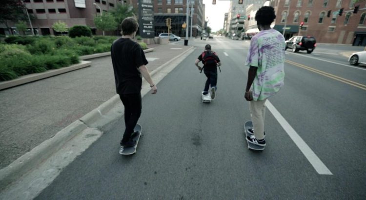
Bing Liu, a young Chinese-American director and cinematographer, released his debut feature film, Minding the Gap, in 2018. The documentary accrued positive reception from skateboarders and film critics alike, and racked up several awards and nominations, including one for Best Documentary Feature at the 91st Academy Awards.
Minding the Gap is a beautiful, deep film that follows Liu himself and two of his friends, all young men who grew up in Rockford, Illinois, a Rust Belt city plagued with unemployment and violence. Although footage was accumulated over 12 years, the bulk of the focus centers on the most recent few years, when the men are entering adulthood from adolescence.
The documentary follows Liu’s peers Keire and Zack, who struggle to create content lives for themselves after growing up in abusive homes. Keire, an 18-year-old black young man, works as a dishwasher and then a waiter. Throughout the film, interviews reveal that his father was emotionally and physically strict, then passed away when Keire was a teenager. Zack is 22 years old, and works as a roofer to support his girlfriend and their infant son.
Throughout the ninety or so minutes, thrilling scenes of skateboard tricks are interwoven with heartfelt interviews with the subjects. Posed as a film about friendship and skateboarding, the film explores dark but real subjects such as domestic violence and abuse, alcoholism, and toxic masculinity. Information about Liu’s childhood are slowly leaked, through self-narrative and interviews with Liu’s mother. She tearfully addresses the camera, and admits her regret for not interfering or leaving sooner when discussing how her husband/Liu’s abusive stepfather beat both of them regularly. Meanwhile, Keire grapples with growing up and setting up a positive path for himself, while Zack deals with increasingly violent disputes with his ex-girlfriend Nina and heavy drinking. (Liu discovers that Zack has been hitting Nina during their fights). Viewers realize that skateboarding is truly a way through which the men escape their difficult realities, especially during adolescence. Shared trauma and an emotional understanding clearly connects the trio beyond skating.
I won’t reveal the post-script, but it provides a nice sense of closure to the moving film. I was so pleasantly surprised by the content of the film, which touches on the realities of racism, domestic violence, and economic disparity in 21st century America. If you’re an avid skateboarder or a passionate film buff or just searching for a documentary to obsess over, I strongly recommend Minding the Gap. It’ll change your perspective on a lot things.
Not much is known about Maria Medem’s life, but the Spanish illustrator has been making waves on social media for her simple but charming illustrations. Medem’s atmospheric compositions boast textured gradients, thin lines, and humorous characters engaging in ordinary acts. Kiblind Store describes her art style as “opening worlds… creative space-time: alternate realities where the procrastination of the soul becomes landscapes.” With minimal shadows and colors, the artist effectively transforms the image into a peaceful universe that recalls Japanese woodblock prints. Medem has stated that some of her inspirations are Moebius, Hokusai, Utamaro, Ikko Tanaka, and Cody Cobb among many others.
Medem’s book, Echoes, published in 2019, features beautiful prints that connect intriguing stories and realities. The main character is water itself, as the consistent theme that permeates the book’s pages, meant to be read as both single-page comics and an interconnected work of art. Some other recent publications include Cenit and Satori among a number of zines. But the Seville-based illustrator may be most known for her editorial illustrations, particularly those commissioned for The New York Times and AIGA. Although the subject matter of the illustrations may be sometimes strange or dark, Medem carries the ability to make any scene alluring and calm with the simple tools of ink and Photoshop.
Overall, Maria Medem’s contemplative illustrations call attention to the mundane and finding beauty everywhere. With a simple but bright color palette, Medem’s art boasts the power to capture the viewer’s full attention and forget about the external world. Perhaps that is the best way to view such illustrations, to allow oneself to be in the present moment.
Illustration for AIGA Eye on Design
Poster for the II Festival de Poesía Joven de Alcalá de Henares
Natalie Guisinger is a senior pursing a BFA in the Stamps School of Art and Design. An avid photographer and designer, she is also Editor in Chief of SHEI Magazine. I sat down with Natalie to discuss her inspirations and aspirations in the creative world.
To Natalie, art has become an integral part of her life since high school. She took just one formal art class in high school but fell in love with photojournalism through yearbook. She also explored different ways of making outside of school, by knitting, sketching, and even building her own boomerang and longboard. Natalie applied to one art school, Michigan. “It sounds cliche, but art becomes embedded in your life.”
Human resilience and raw being are the main themes of Natalie’s photography–“I like to use art to portray human life in its most authentic form. My passion is storytelling through photography and I love getting to know people by observing their actions and interviewing them.” Being a part of SHEI has emboldened this passion, as it allows her to work collaboratively with a variety of talented students. “We all support each other. School has taught me that there are so many interesting people out there; we can communicate and exchange ideas to make awesome creative projects.”
On where she aspires to work, Natalie hopes to continue helping people, specifically sharing stories of underrepresented people: her plans include applying to news publications or joining the Peace Corps. After traveling to places such as Tanzania and Copenhagen in the past two years, she’s not sure if she wants to go abroad or stay within the United States for a while. She says, “I enjoy working with people on an immediate and intimate level. I know it sounds vague, but I want to make sure I do what I love.”
SHEI Magazine Nightlife Street Style – Winter 2020
Google “Julian Glander” and you’ll be met with an array of colorful, whimsical images of anthropomorphic animals or chubby blobs. Enter the world of Julian Glander, a young 3D artist based in the United States. Known for his fantastical animations, his impressive portfolio consists of editorial illustrations, quirky animations, comics, and even a couple video games. He has worked with Adult Swim, Disney, the New York Times, and more impressive clients.
Overall, Glander’s style is overwhelmingly colorful and vibrant. Round blob people move in intriguing ways surrounded by explosions, rainbow tears, and sparkles. It’s the type of art you can stare at for hours, and something I would imagine an [illicit substance] trip to be like. What wows me about Julian Glander is his prolific creativity–it’s evident that he is an artist who never stops making. Immerse yourself in these wonderful illustrations and be sure to check out more of his work!
http://glander.co/ART-SQOOL
NYT Thanksgiving
Take a Penny
Clairo Lazy Days Tour
b3Drooms
20-Something Egg with Legs, Living in the Big City, Trying to Make It in a Vaguely Creative Field