Industrious Illustrating #52 – Experimentation

Hello, and welcome back to another week of Industrious Illustrating! It’s now 2024, which opens up a lot of new possibilities and directions for the rest of the year. That means I want to highlight a few drawings I’ve made recently that are more experimental or different from what I usually draw.

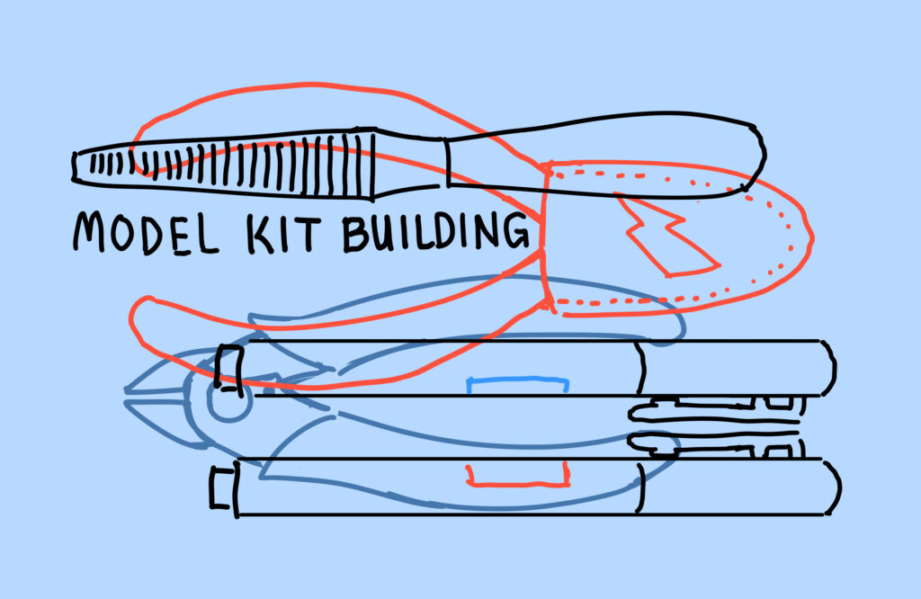
This was more of a graphic design-esque drawing I made for some zippered coin purses that I ordered from a supplier during a sale depicting a plastic file, two different types of plastic nippers, and two hobby markers that would all be common tools for building model kits. I wanted to go for something simple yet bold, as my usual style focuses a lot on details and elaborate painting.

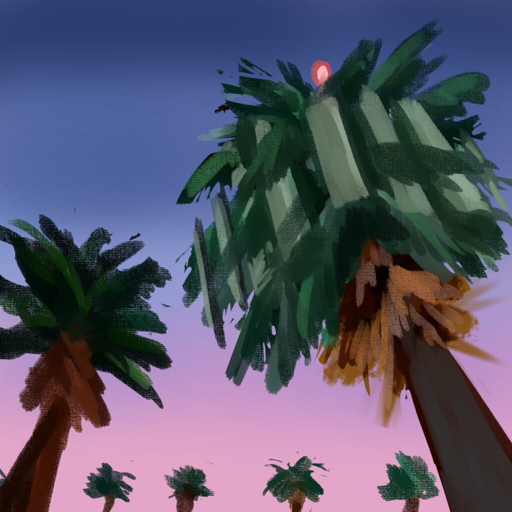
This, meanwhile, is a quick digital doodle of the cell towers disguised as palm trees that I saw all around the Los Angeles and Orange County areas when I was visiting family there over winter break. I wanted to convey the feeling of driving home after a long day and realizing something is slightly off with one of the freakishly tall palm trees lining the freeway. I also wanted to free myself from needing every drawing to be highly polished, so I set myself a time limit on this one and stopped drawing once the 20 minutes was up.

That’s all for this week, but I want to wrap things up with a quick question. What ways have you personally experimented with your artwork recently — and if not, how will you experiment with it in the future? I’d love to hear about it!

Industrious Illustrating #13 – Mini Con Ja Nai

It’s now the first week of October, and that means that Animania (UMich’s anime club) is hosting Mini Con Ja Nai in the MLB on October 8th between 12 to 7 PM, and that also means that I’m nearly fully prepared now to table at the Artist Alley there! I’ve been working on ordering, preparing, and categorizing my inventory over the past few weeks in addition to creating new print-worthy artwork.

While I’m not a graphic designer by any means, I had to make these graphics for myself so that I could have helpful product “menus” for customers to look at. Unfortunately, being a sole proprietorship means that I have to do all of my business-related stuff myself, which means that I can’t just focus on making more art. But as long as that means that I get to enjoy conventions and selling my work, I’m willing to put up with having to learn a wider variety of skills to do my job.

  If you’re able to make it to Mini Con Ja Nai this Saturday (which is tomorrow as of this posting), I hope to see you there! If not, see you next week when I make my next Industrious Illustrating post!

Artist Spotlight: Swissted

Swiss modern graphic design and punk rock music, what’s not to love? A project created by artist and designer Mike Joyce, Swissted is a collection of posters that utilize simplistic Swiss design to advertise historical rock shows. Although seemingly polar opposites of the arts field, Joyce makes punk and modern design blend together beautifully.

Graphic design originating in Switzerland in the 1940s-50s is also referred to as the International Typographic Style. You might recognize other works by designers such as Josef Muller-Brockman or their usage of simple shapes and Helvetica or Akzidenz Grotesk typefaces. During the development of graphic design in the 20th century, designers stressed the combination of typography, composition, and communication.

Mike Joyce’s surprisingly effective solutions cover renowned music artist and bands from Public Enemy, to The Velvet Underground, to David Bowie, to Radiohead, and many more. His posters are full of bright colors and alluring compositions of large shapes. For any graphic design fan or music lover, these posters are a must-have.

Available at museums all over the world, dozens of vibrant posters are also able to be purchased on the Swissted website. I can’t wait to get one for my apartment! Although which one is another question…

There are too many amazing posters to show, but here are a few!

The Fascinating Work of Jennifer Daniel (Google’s Emoji Boss)

Jennifer Daniel, Google’s Expression design team Design Manager, oversees gifs, emoji stickers, and camera filters. She is also an illusrator, author, and mother. Before her position at Google in California, Daniel worked for numerous years at the media giants the New York Times and Bloomberg Businessweek. I had the chance to see her speak at the Penny W. Stamps Distinguished Speaker Series last year, and she impressed the crowd with her wit and humor. Above all, Daniel’s vibrant, engaging work invites viewers to indulge in the fun parts of everyday life. She is a designer of true honesty and immense talent.

One of her works I find most alluring is Space: A Children’s Text Book published in 2015. The neon volume boasts pages of clean, beautiful graphics of planets and our solar system, and a plethora of facts about space. Although described as a “simple, attractive book of infographics,” let’s be real here, this book is for adults. I could spend hours poring over its colorful, info-packed pages, and will be sure to purchase a copy for my coffee table.

Image result for jennifer daniel space

Images from Space

Some of Daniel’s portfolio includes editorial illustrations, infographics, and animations. I am personally drawn to designers with bold, simple lines, and colorful graphics and Daniel certainly fits the bill. Drawing from both retro and modern inspirations, her illustrations are so aesthetically-pleasing to look at. Be sure to check her out!

All Work and No Play – Graphic for Good Magazine


Infographic for Bloomberg Businessweek


Simple, Bright, Beautiful: The Work of Kurzgesagt

I may be fairly late to the game, but a couple months ago I discovered Kurzgesagt, a Munich-based animation studio that makes informative YouTube videos and brilliant artwork. The studio’s signature style is based off of rounded shapes and vibrant colors, and means “in a nutshell.” Their beautiful videos showcase their dedication to knowledge, producing impressive animations about scientific subjects such as space, technology, and biology. At first, I thought it was a single artist behind the amazing creations, but discovered it is in fact a stacked team of art directors, illustrators, and producers working behind the scenes.

In addition to producing popular YouTube videos, the group also works as a creative design agency, creating illustrations, branding, merchandise, and graphic design solutions for clients (notably the Bill & Melinda Gates Foundation!).

There is something simply mesmerizing about the studio’s simplistic style–its rich use of color and boldness. I have noticed many illustrators borrowing Kurzsegagt’s artistic style, but the original agency stands out for its consistency and passion for education. Be sure to check out Kurzgesagt’s beautiful work on their channel and below!

What if We Detonated All the Bombs at Once?


Image result for kurzgesagt
Optimistic Nihilism


Image result for kurzgesagt
The Great Filter