

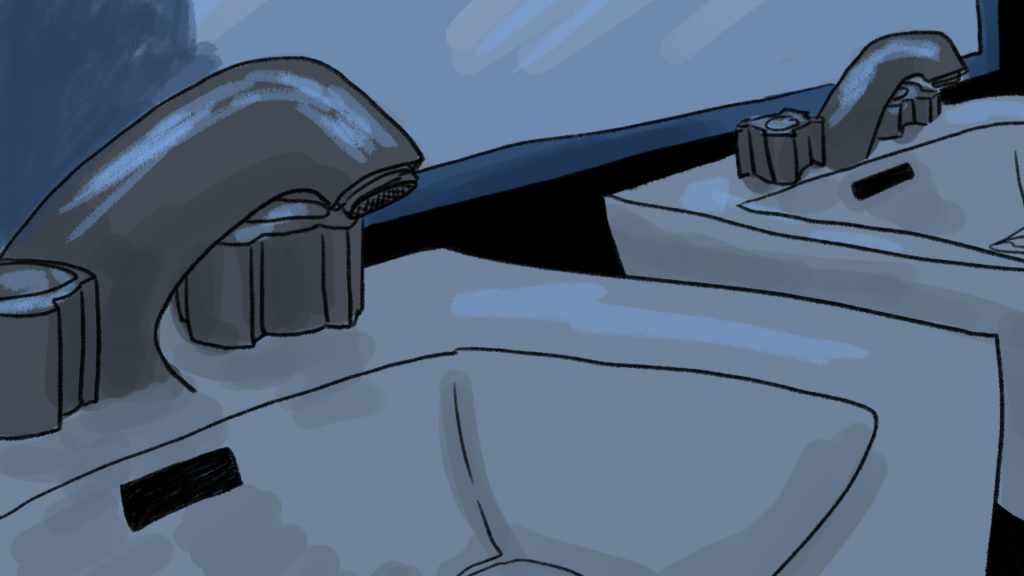
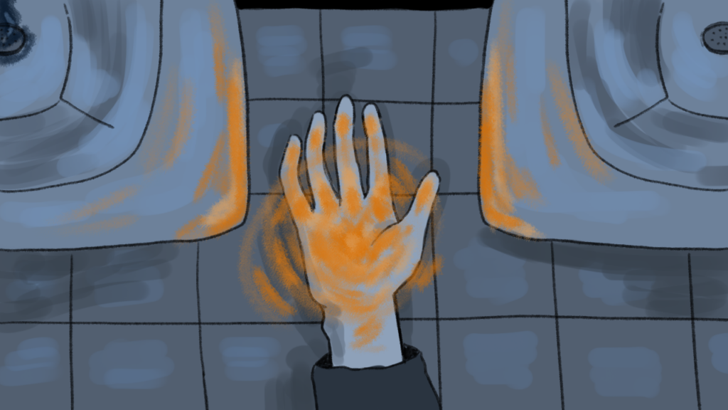
This week I started the second scene of my animation. I wanted this scene to feel distinctly different from the first one. I thought a contrasting color palette would be a good way to show this. For the first scene I used a dark red color palette to feel ominous and heavy, so I decided to use primarily blues and greys to create an atmosphere of isolation/melancholy in the second scene. In both scenes, I wanted the yellow light to stand out. Not only to emphasis its importance, but also to indicate that it is the same light and the same person in both scenes. When drawing each frame by hand, especially over a long period of time, I find it’s difficult to maintain stylistic continuity. I’ve tried to combat this issue by keeping a list of what brush I use for which lines, and frequently referencing previous frames for consistency in coloring and shading. Below are the first two backdrops I’ve created for the second scene, as well as my entire piece so far:

Leave a Reply
Be the First to Comment!