
Great album art is incredibly powerful, but I feel as if it’s often overlooked by consumer and producer alike. People take it for granted, thinking of the physical representation as just a means to deliver the real product, the music. However, I would argue that the music is only half of the product, and that the music itself is almost entirely defined by its presentation. I’ve always been fascinated by the wide variety of art styles on album covers, but my passion was recently reignited when I saw the album cover for the new Flume mixtape Hi This Is Flume. It grabbed my attention and didn’t let go; the vivid colors, the straight lines and framing of the picture, and most importantly the beautiful painting on the hood of the car. Even though I knew who Flume was and didn’t mind their music, I never really cared for it much. However, I listened to the entire album right when I saw it, that’s how intrigued I was by the cover. My point: it’s all about first impressions, just like meeting a new person. Sure the music is important, but nobody will listen to it if you can’t get their attention first.

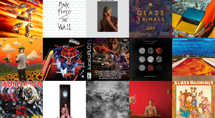
Beyond being eye-catching, I think an album cover has the power to enhance the music and add an entirely new element to the project. It sets a certain mood and interpretation for the album; you listen to it differently than if it didn’t have an album cover. For example, when I listened to the Flume album I expected it to be interesting and experimental, just like the album cover. As a result, I interpreted it through that lens and ended up loving it. I honestly don’t think I would have cared for it much if I wasn’t already expecting it to be different and experimental. I’m not saying the music isn’t good, I’m saying that the aesthetic of the cover opens up your mind to the music before you listen, and then continues to contribute to the overall feeling of the album. A lot of great albums use this to their advantage (such as the ones in the header image), and it makes a noticeable difference. It really ties the project together as a whole, and turns the album from a collection of songs into a musical journey. When I think back on an album that I loved, the first thing I remember is its aesthetic; the feeling and tone of the album that makes it entirely unique. It’s the album art that always determines this, because it’s the album art that gave the first impression.
Looking towards the future and the increase in purely digital music raises a lot of concerns with me. There’s something to be said for being able to hold the music as a product, and experience it in more ways that just auditory. If you’ve ever listened to a vinyl record or a cassette tape, or even just looked at one and admired its ingenuity, then you know what I’m getting at. Not only does digital music lack these things, I’m also worried that album covers for purely digital projects will more often be overlooked. It’s no longer a work of art that you can hang on your wall or collect; if you’re lucky it’s a thumbnail size image with good resolution. Obviously physical forms of music will always be around, and I’m sure there will still be artists such as Flume who continue to realize the importance of presentation, but I also think that we should all take a minute to appreciate the unique artistic medium of album covers and realize their importance in the art of music.

Leave a Reply
4 Comments on "Album Art Aesthetics"
Completely agree with your post! Really great album art helps evoke the sentiment of the album’s music itself; it’s the visual element of color design and the general tone of the artwork that implicitly complements our listening experience. Some of my favorite examples – The Glow, Pt. 2 is emotionally exhausting and solemn, which is matched by the use of a weathered beige along with this imposing elephant figure. Judas Priest’s Firepower is explosive and mechanical-looking, which obviously fits the album’s aural consistency in its shredding, ripping guitars. And like you said, the newest Flume mixtape is jittery and experimental, reflected well by the colorful electronica of the car.
I feel like we’d get along well – I like a lot of those albums in your header. Good post!
Wow, thanks for the feedback! I’m glad to see somebody else has the same understanding and appreciation of album art as I do, it really is a fascinating topic. I also think it’s great that you’ve listened to Firepower; it’s an incredible album, and personally I find it most appealing for the explosive and epic presentation that you mentioned. We’re definitely on the same page, and I’m glad you liked the albums in the header, I wanted to fit in so many more great examples but there wasn’t room!
I love this perspective!
Thank you! I saw your alternate album cover for BROCKHAMPTON’s Saturation 3 album and it’s beautiful, I can tell you feel the same way about good design. Honestly, the art for all three of the Saturation albums was a bit disappointing.